your trusted geotechnical and earthquake engineering experts.
why rebrand?
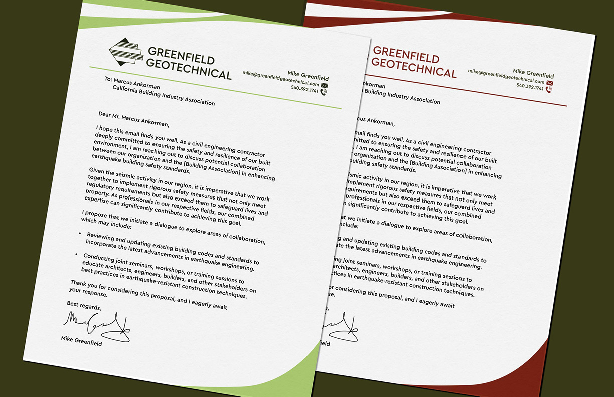
Greenfield Geotechnical desired a fresh, new look in order to stand out from the crowd and attract attention from the non-geotechnical community. The main theme behind the "down-to-earth" rebrand is Greenfield Geotechnical's homebase: Portland, Oregon.
logo design
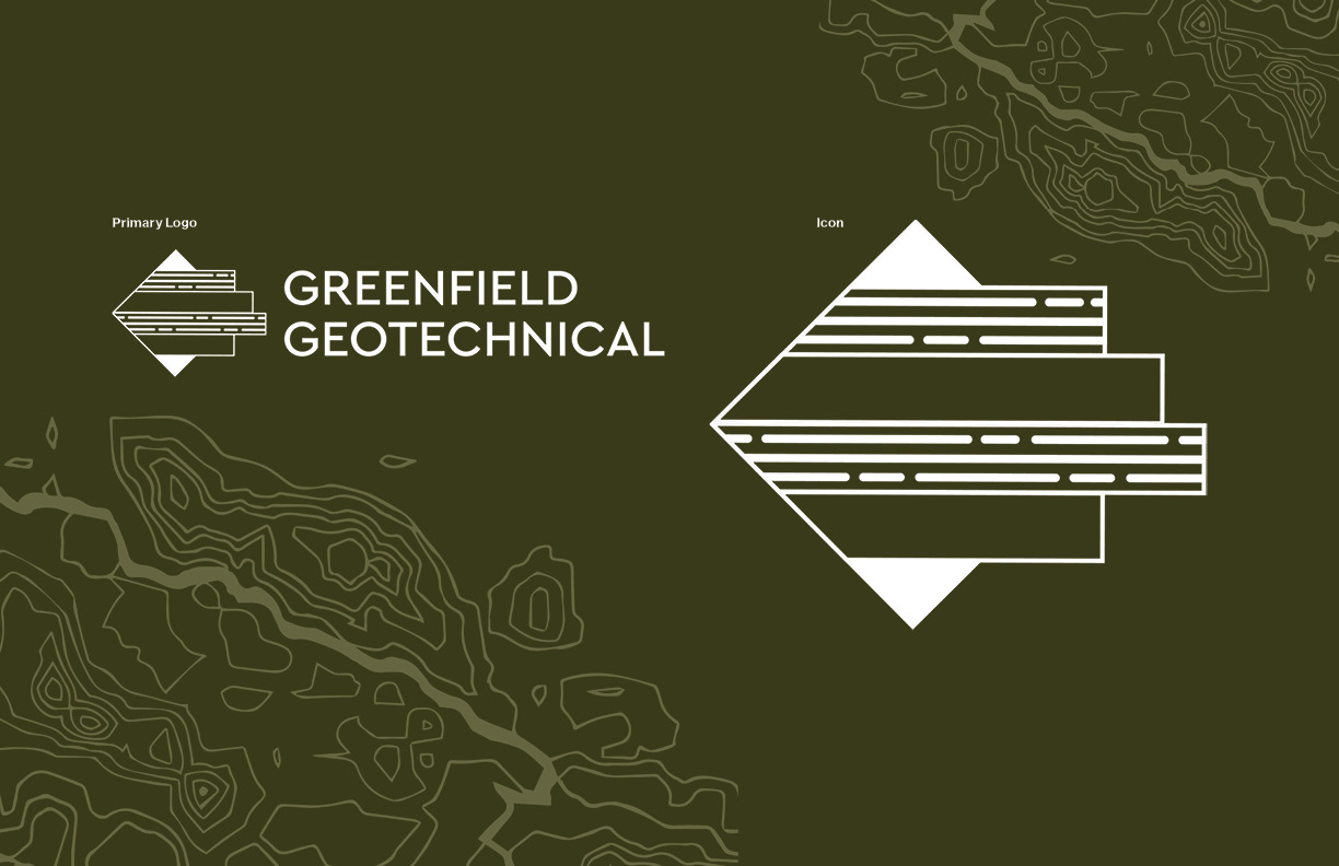
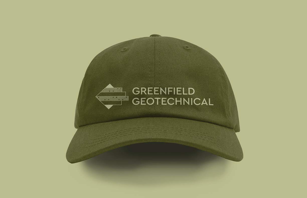
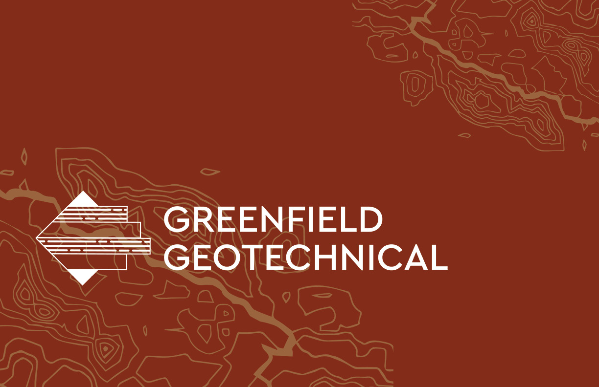
Stratigraphy is the driving force behind the logo's design. The soil layers emerge out of the diamond are differentiated by having lines present in the layer or not. The typeface, Cera PROModern, is highly legible and complements the icon.
type and colors
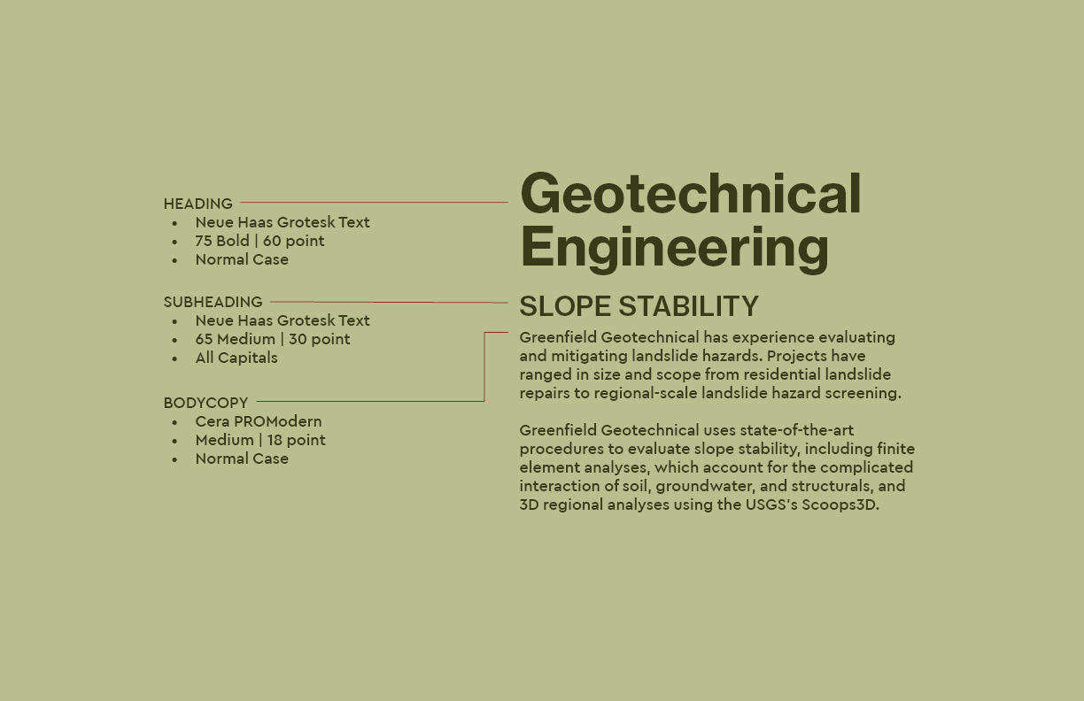
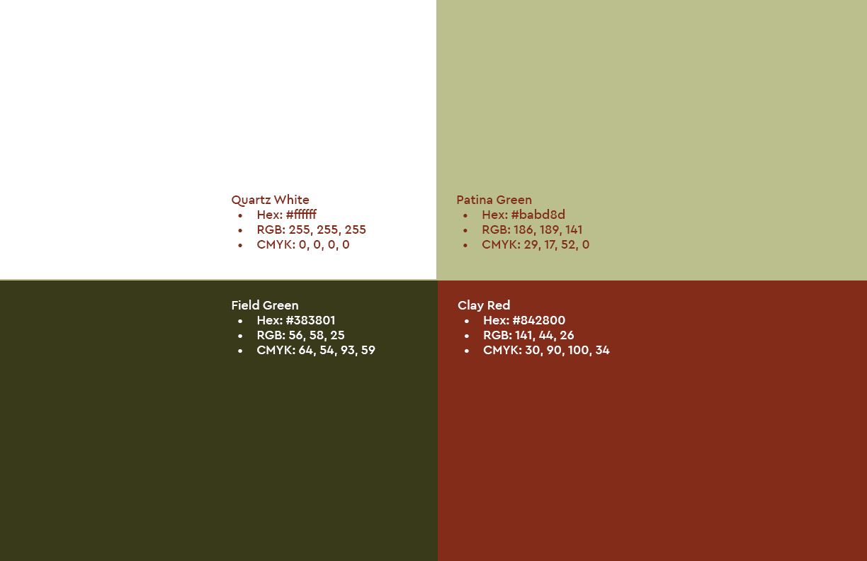
Greenfield Geotechnical's new typography is composed of two sans-serif typefaces that provide maximum legibility and clarity. The overall mood of the color palette is cool and earthy. The clay red shade is based off the red soil native to Portland, Oregon. In contrast, the Patina Green and Field Gree balance out the warmth of Clay Red.
icons and patterns
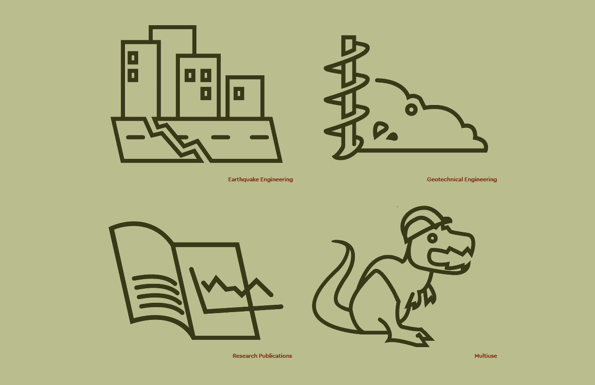
The icons provide a little spice to the overall brand identity. The first three icon represents a different branch of Greenfield Geotechnical's expertise.The last icon is flexible, and it can be used in temporary spaces as a placeholder.
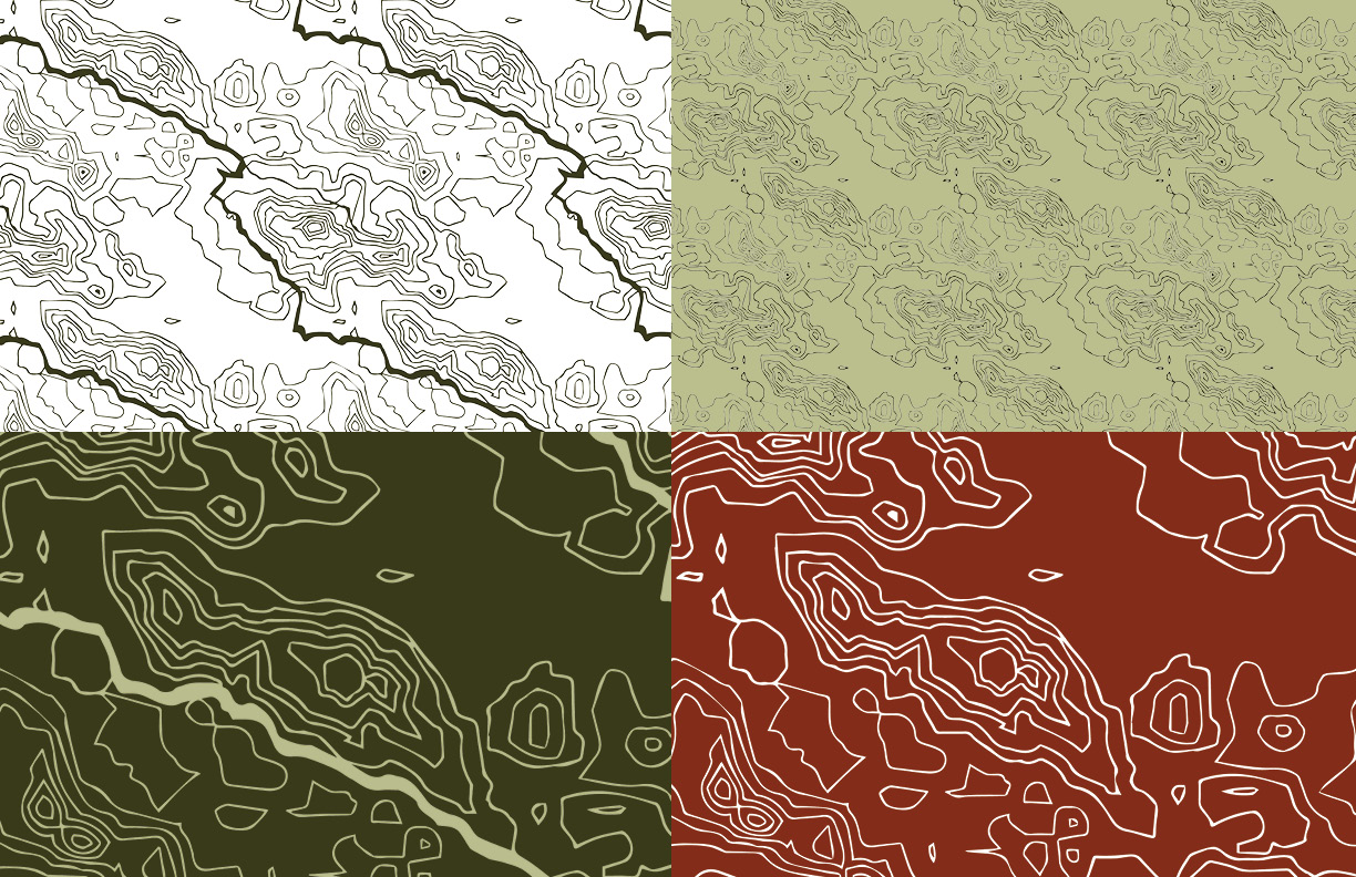
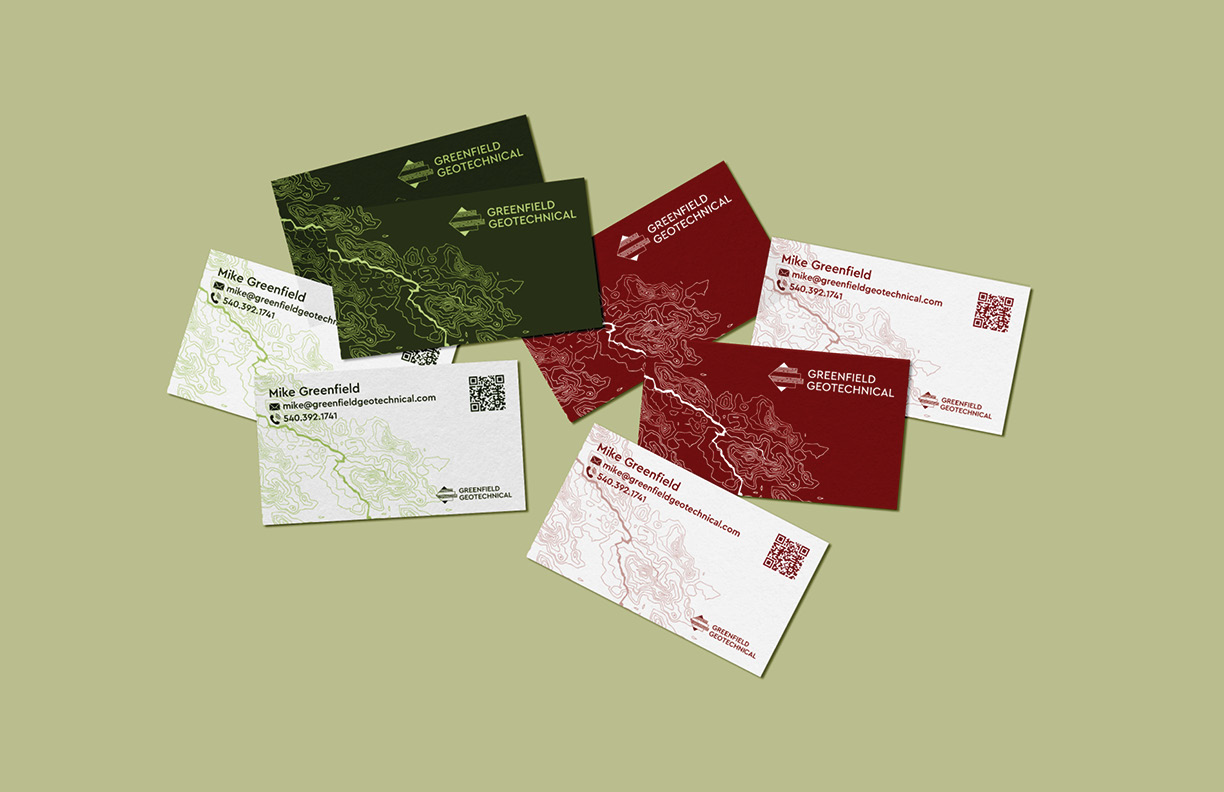
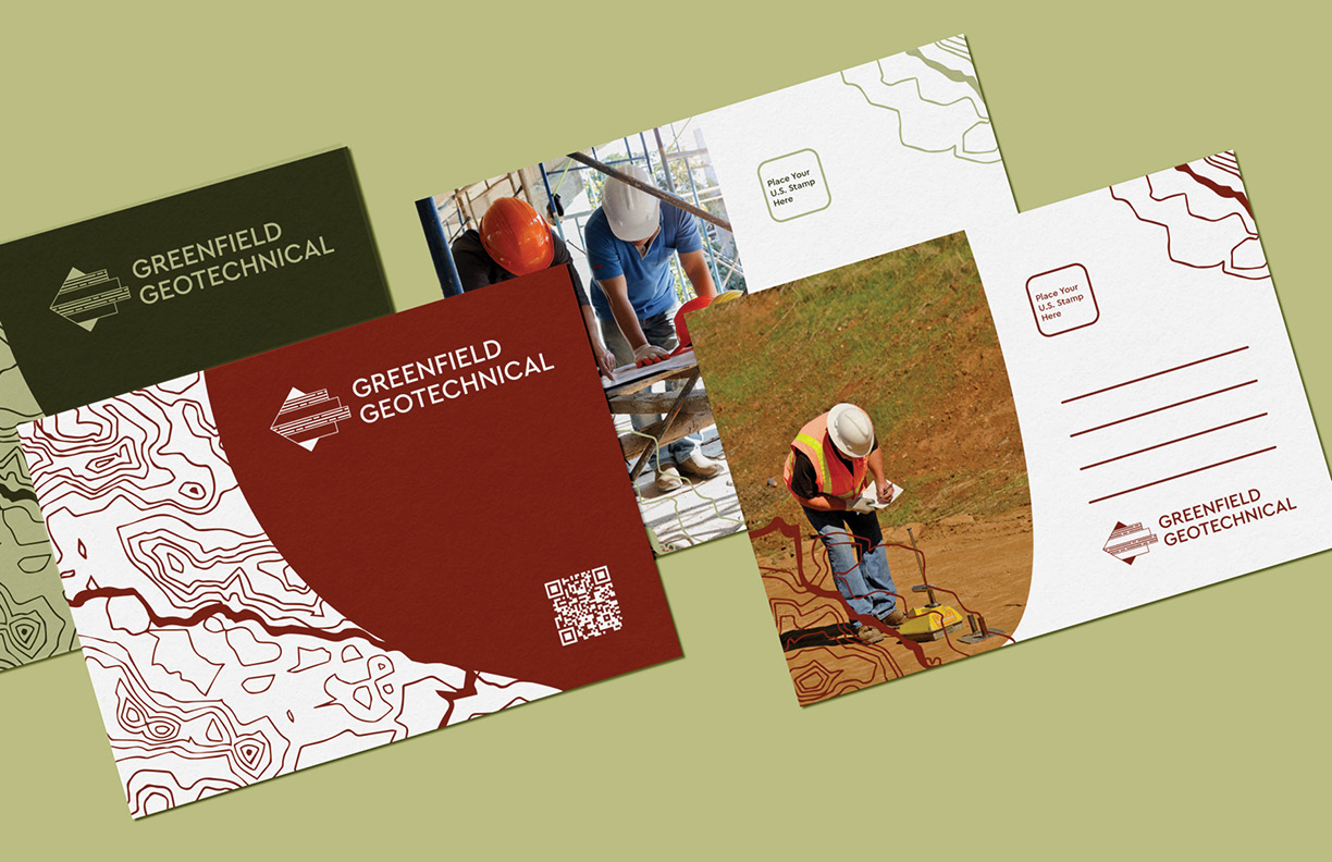
Greenfield Geotechnical's new pattern consists of four variations of Portland, Oregon's topographic map. In the online sphere, the patterns work as background elements that aid in guiding the audience's eye. Offline, patterns can become the main attraction.
online presence
The website utlilizes fluid photography and hover states that engage the audience. In addition, the streamlined design makes the site more approachable for non-engineers to access and understand.
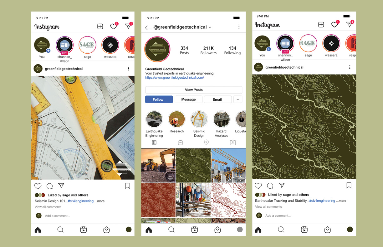
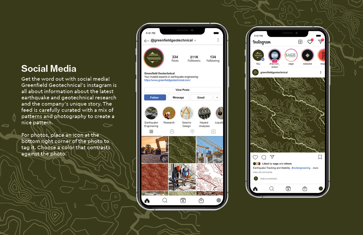
Social media is key to spreading the word about Greenfield Geotechnical and diversifying the network of geotechnical engineers across the country. Mixtures of brand patterns and dynamic photography make social media feed diverse and interesting for followers.
