starting a brand
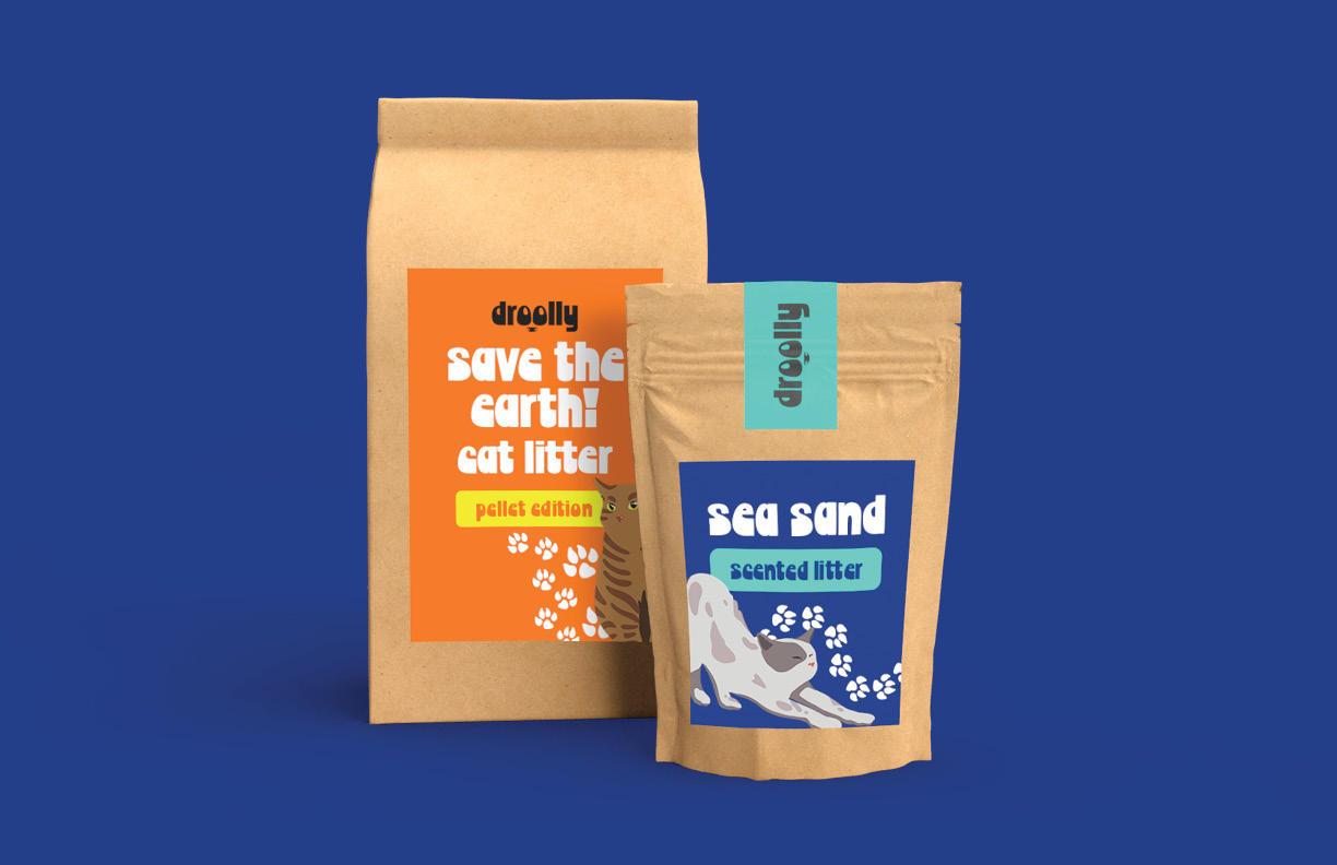
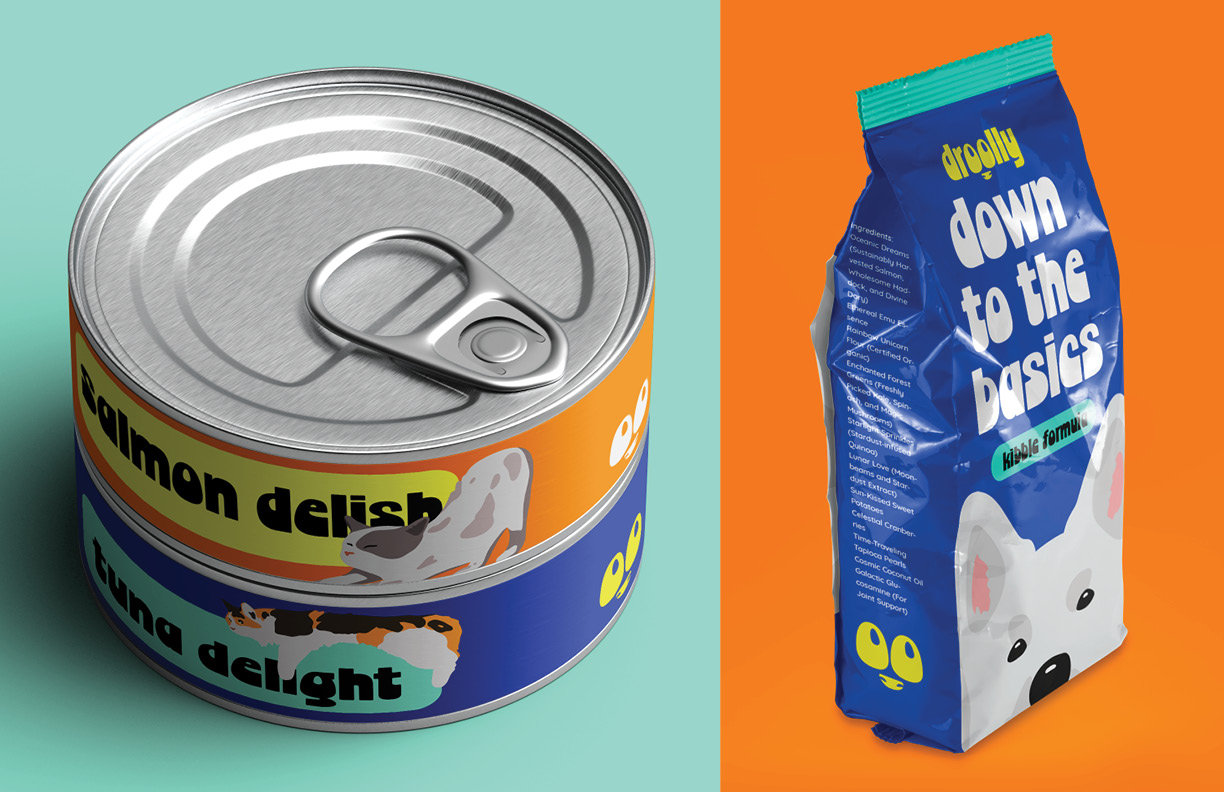
droolly is an up-and-coming pet supply brand, and I was tasked with developing its visual identity. The client was inspired by bright, bold designs that relied on simplicity and illustrations to push its message. Thus, the final direction encompassed the vision the client desired.
logo development
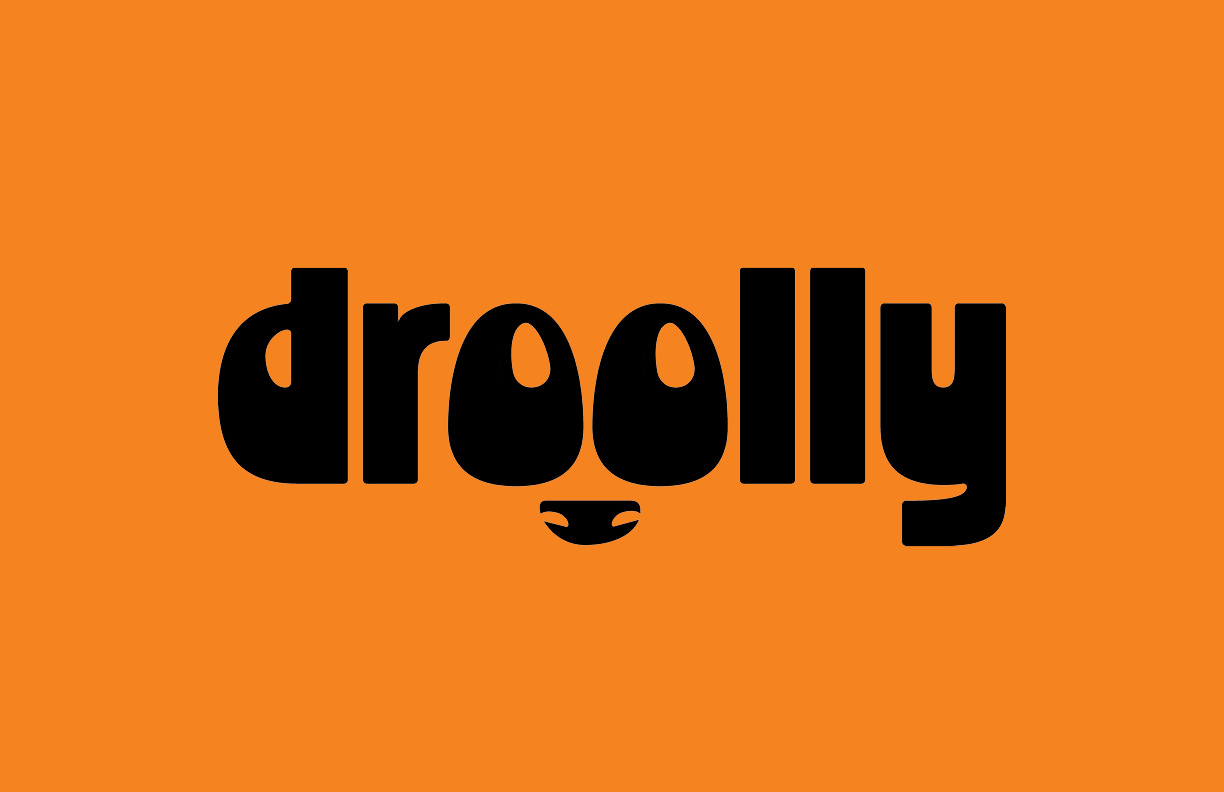
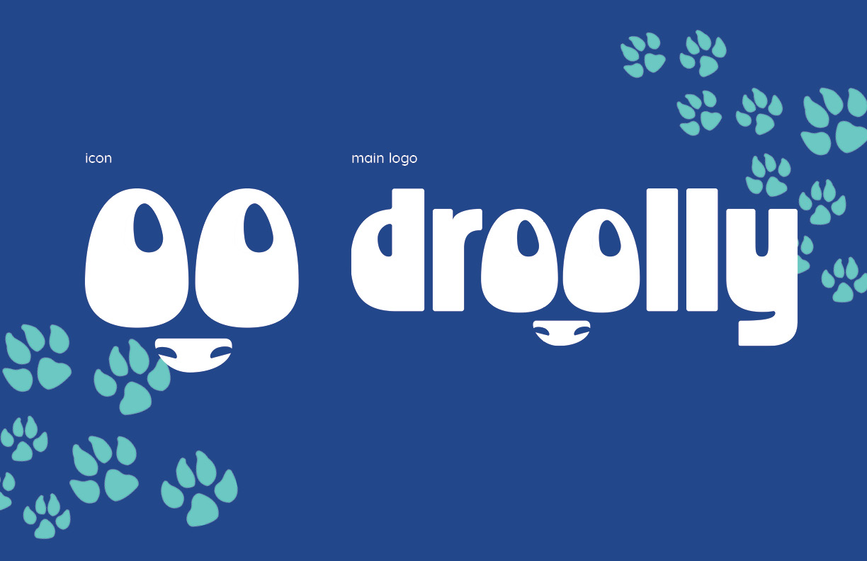
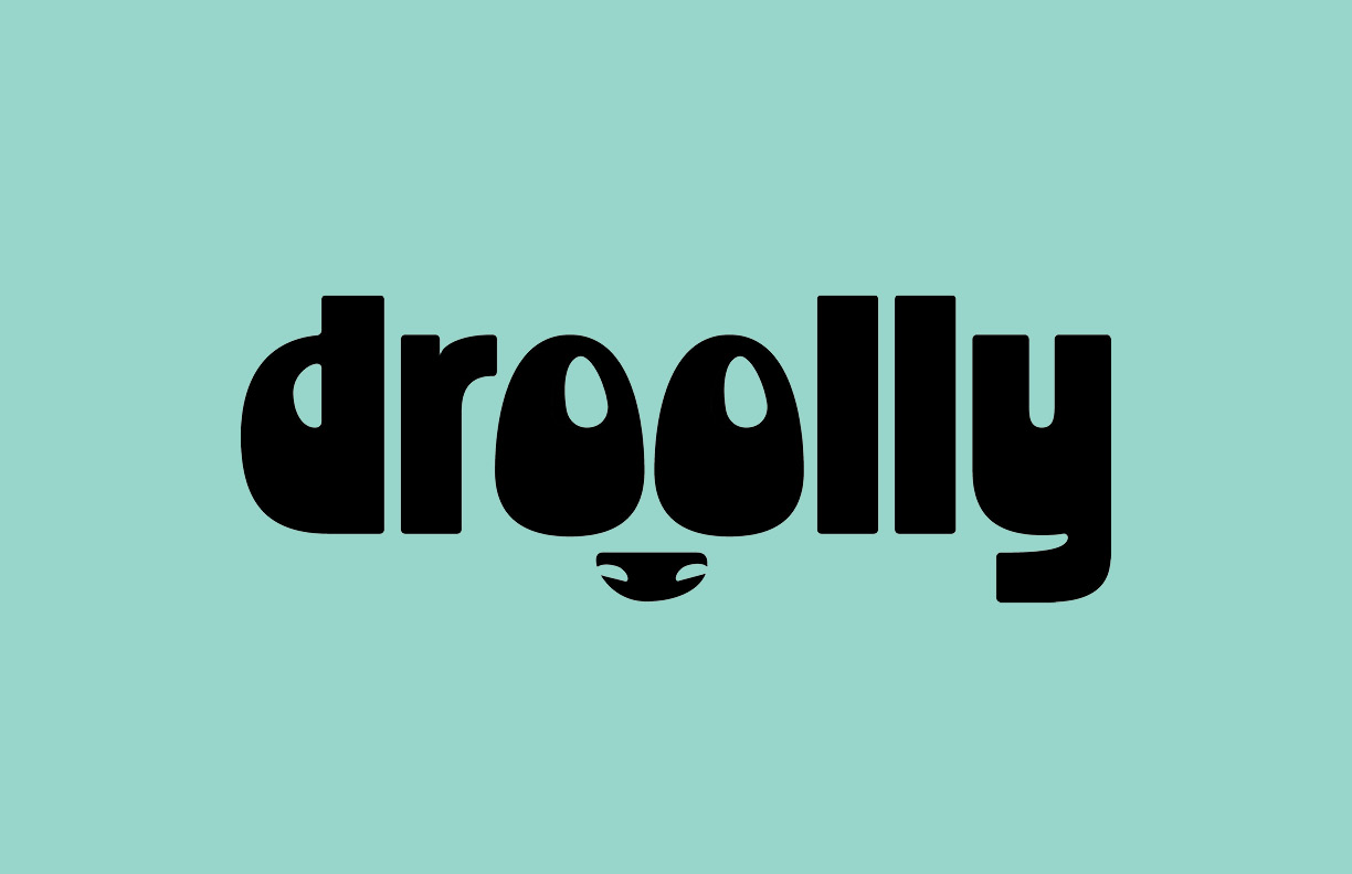
droolly is all about bold text and legibility. When searching for the right typeface, I stumbled across Chorine Large. The first thing I noticed was that the counters of the letter "o" resembled eyes. After some experimentation, the final logo embraces a cute, dog-like countenance.
type
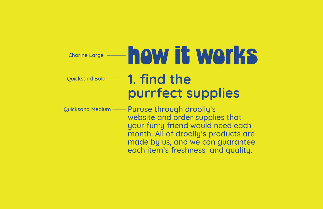
droolly's typography consists of Chorine and quicksand. Chorine is bold and unique which catches the audiences' eye, whether it's placed on shipping packaging or on the shelf. In contrast, Quicksand is perceived as friendly and approachable due to its rounded shape.
colors and patterns
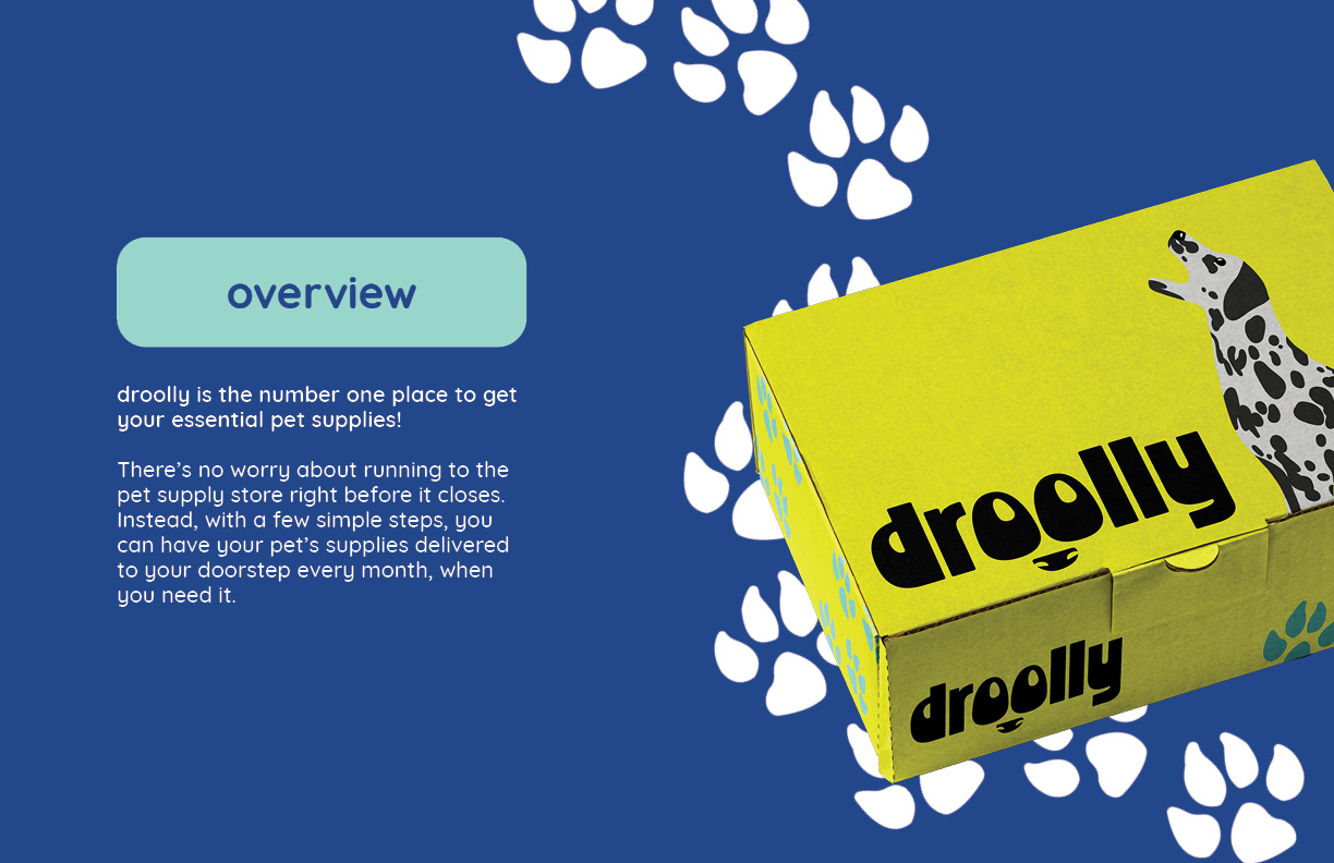
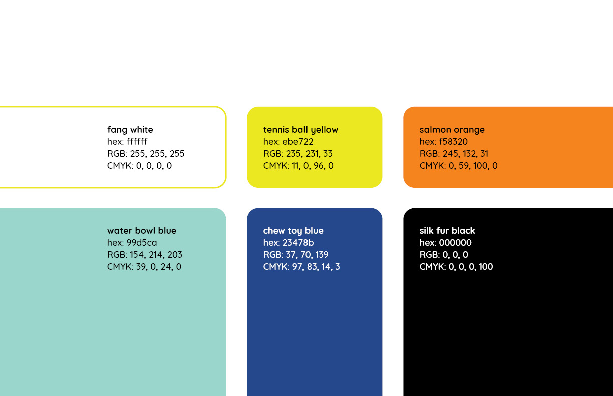
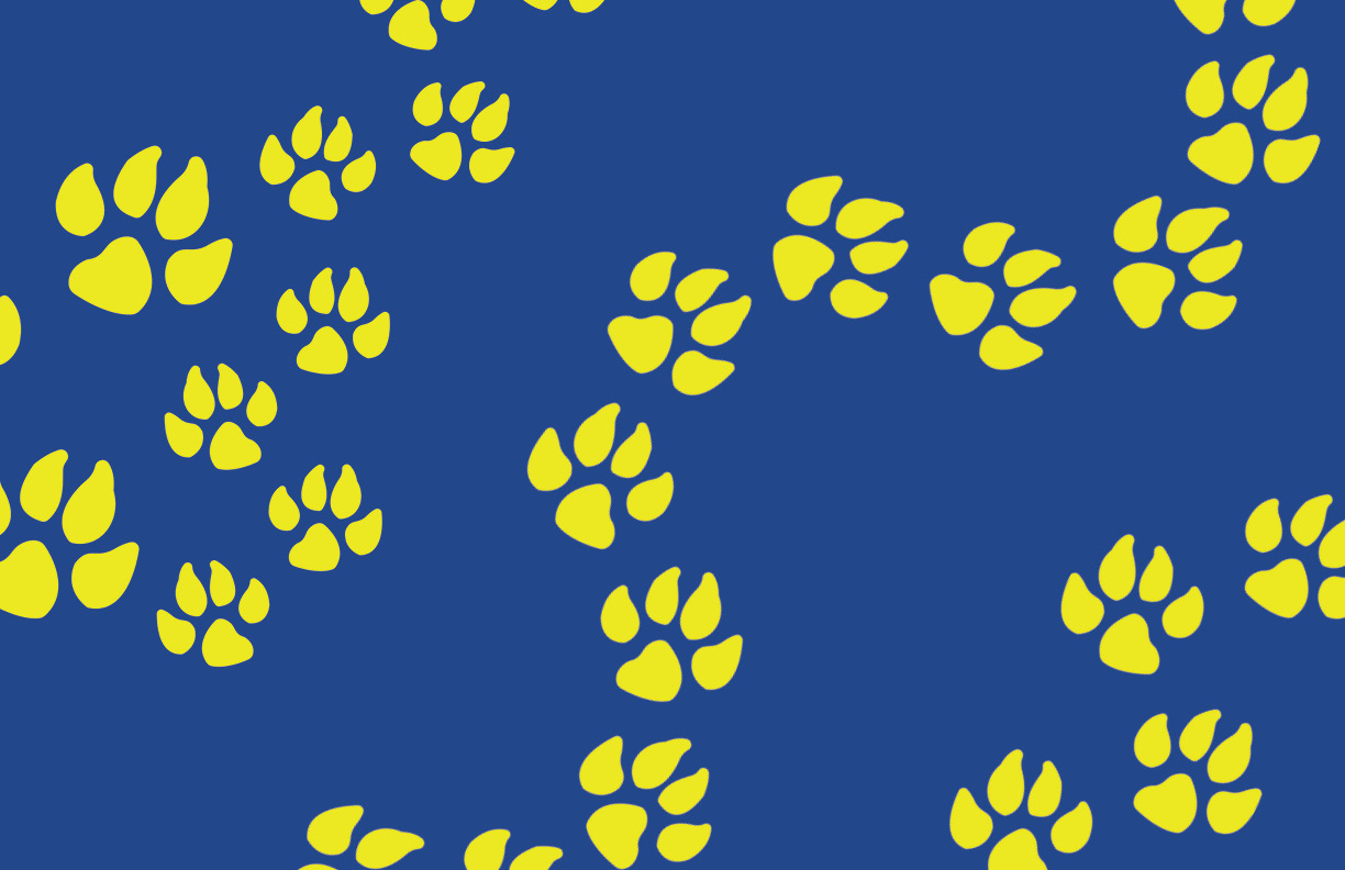
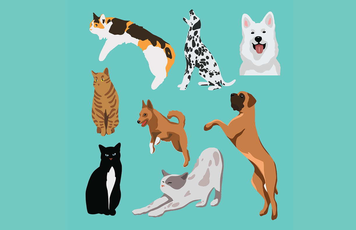
droolly's color palette is poppin' and fun. It makes use of complementary colors in order to balance warmth and coolness within the brand. The patterns take the iconic paw print and transforms it into a dynamic shape that helps lead the audience's eye from one point to another. In addition, animal illustrations are the face of the brand since they are the ones using the product.
