dip your toes into the world of Thai fusion dining.
why rebrand?
Champa had a vision for the kind of customers and experience that they would bring to Raleigh-Durham natives. However, their current visual identity and environment did not quite meet the mark. So, I reviewed Champa's goals and compared them to the current trends among the Gen Z and millenial clients they were targeting.
logo design
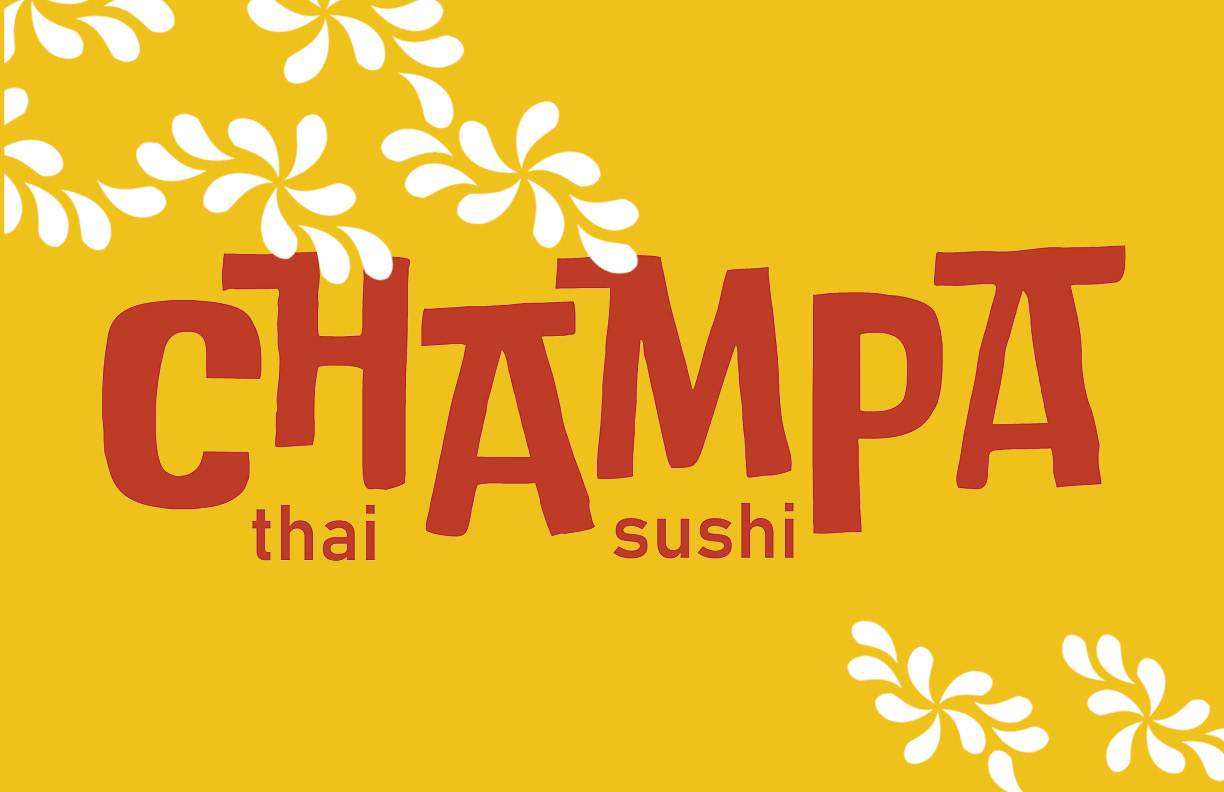
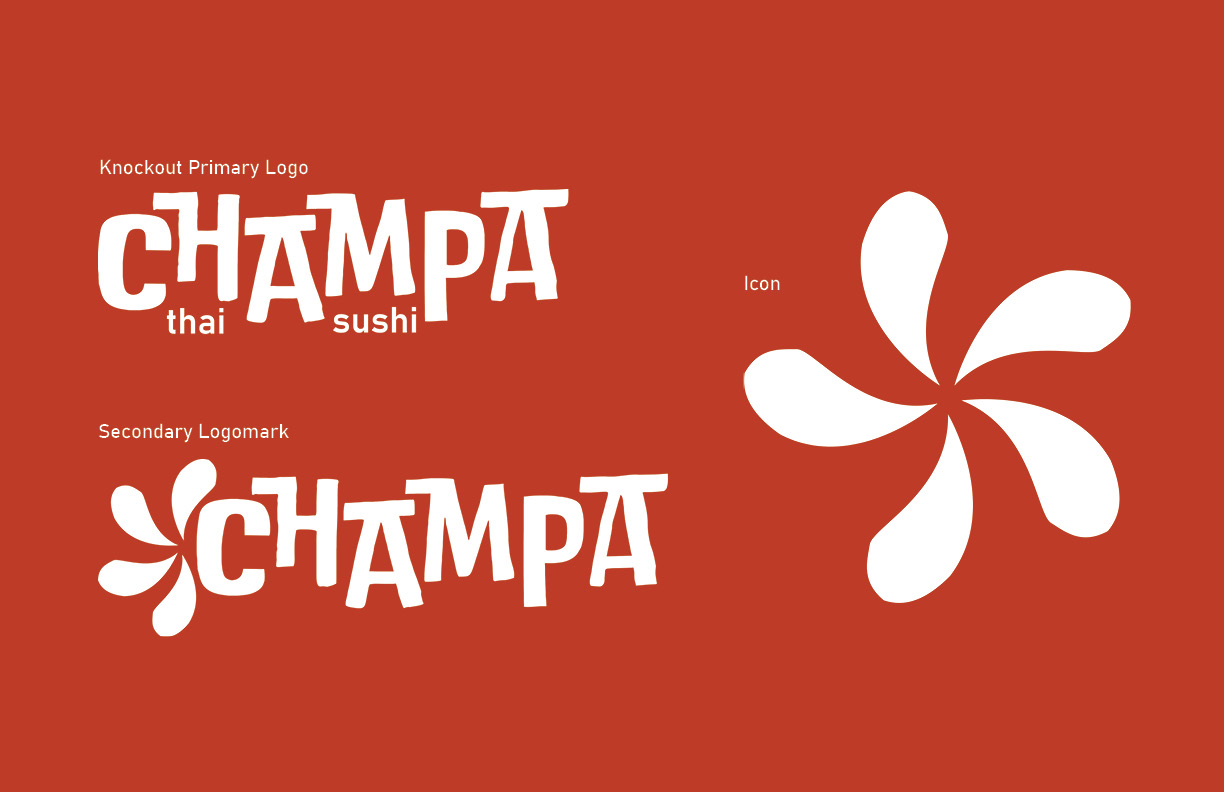
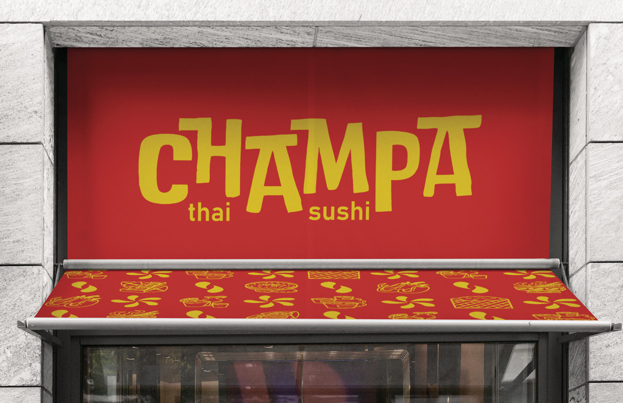
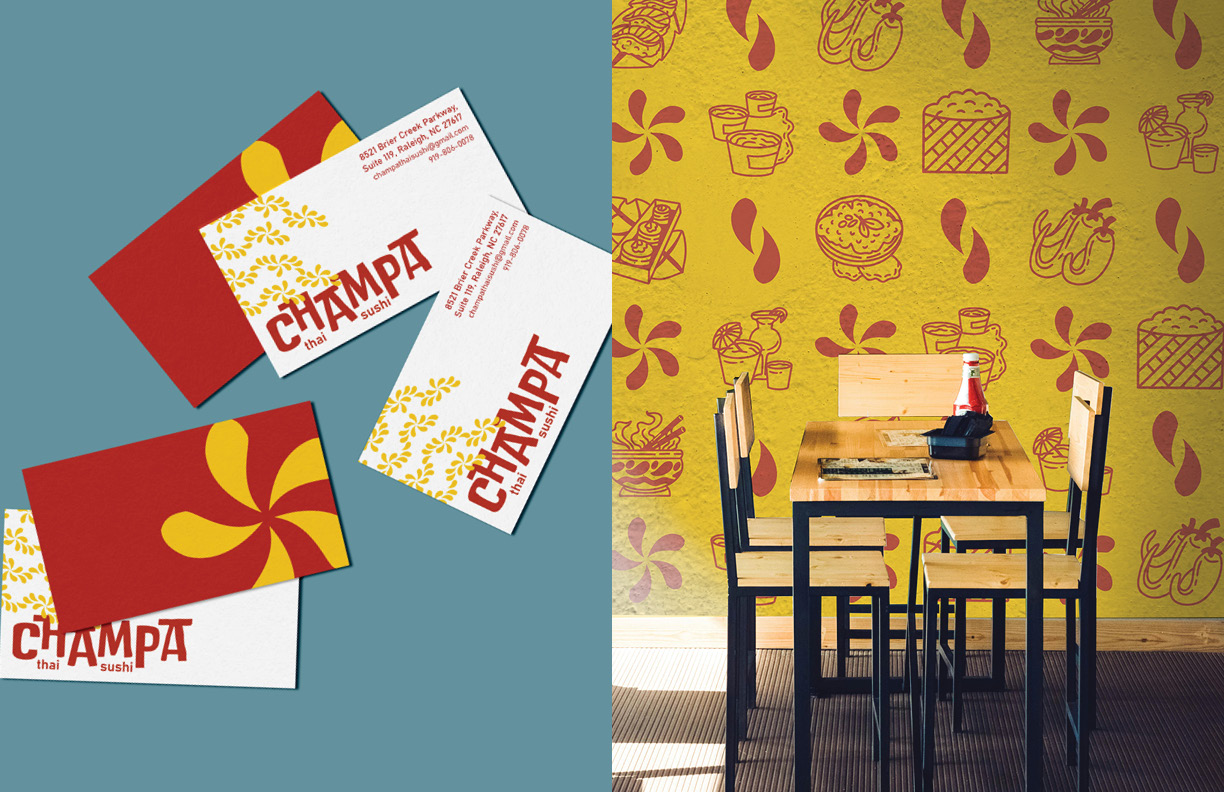
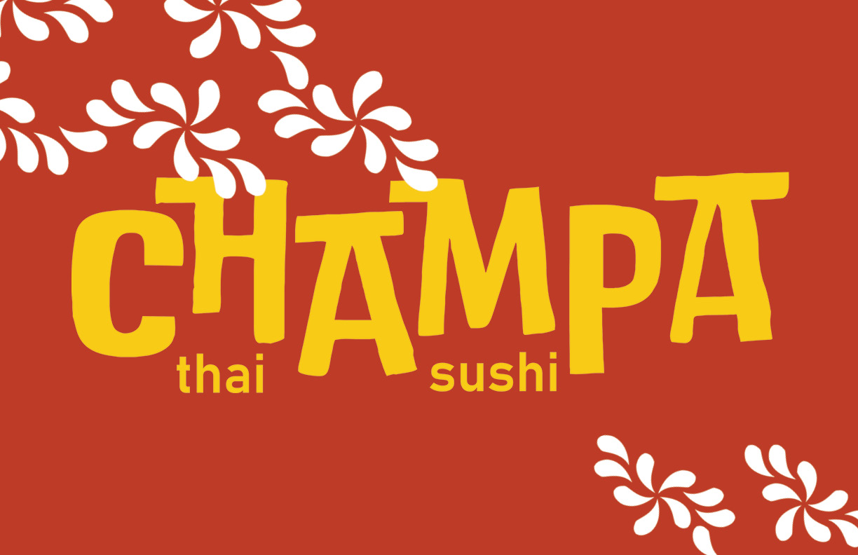
Champa was named after the champa flower native to Thailand. When considering the new logo direction, I wanted to keep the iconic flower as a cenral element to the brand. However, I also wanted to emphasize text as a key factor in differentiating Champa from other competing restaurants.
colors and patterns
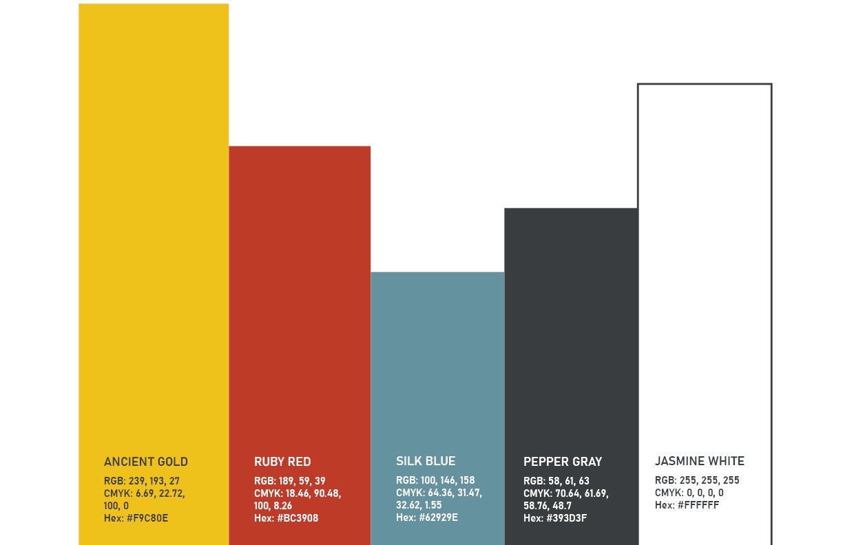
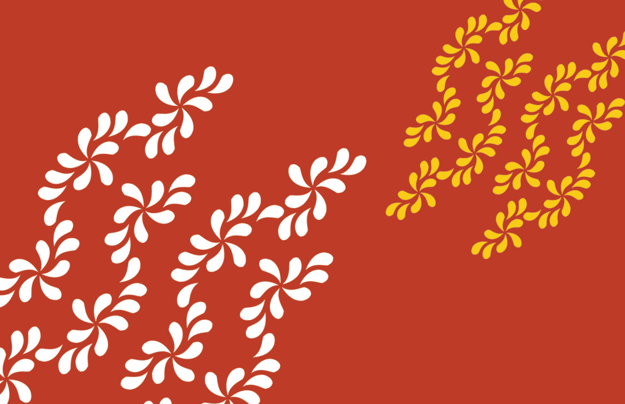
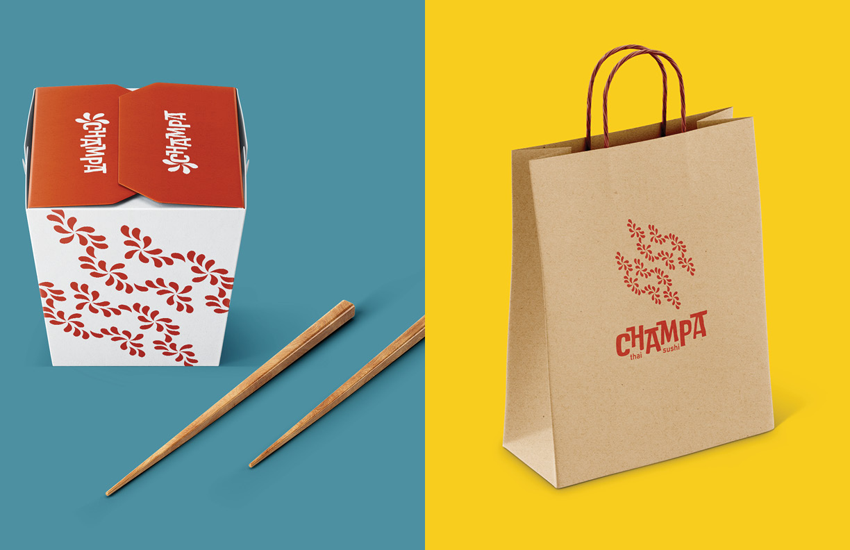
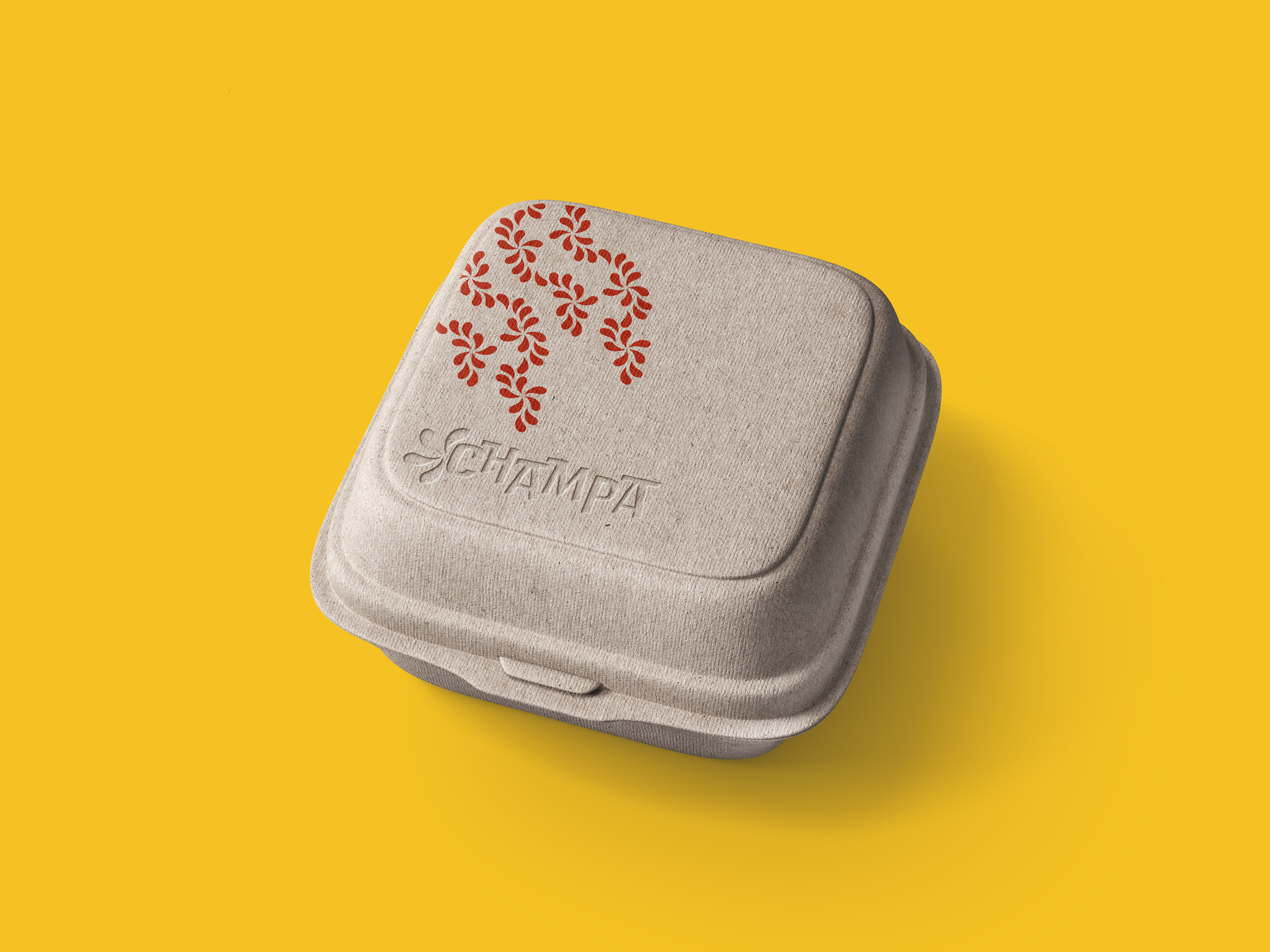
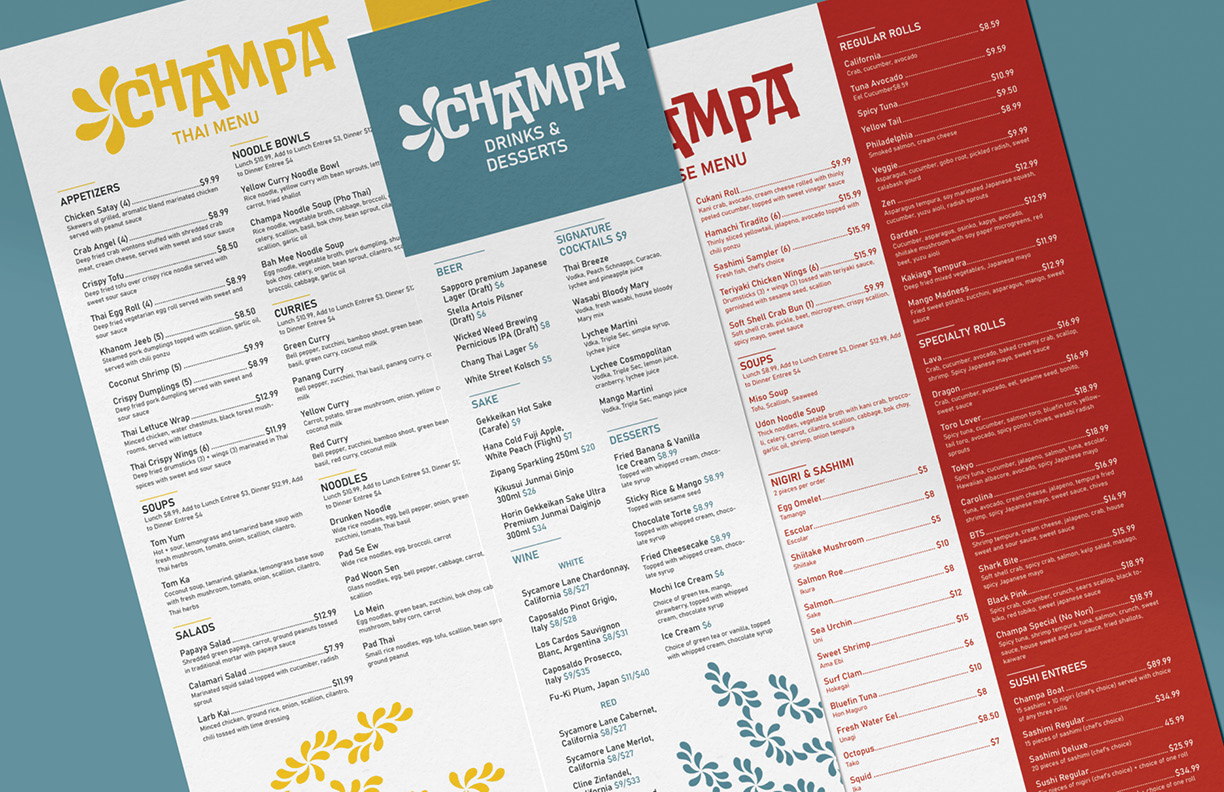
Champa's colors are bold like its flavors. Inspiration stems from real life locations in Thailand. Using the petal shape of the champa icon, several iterations of patterns are formed. Spiced with unique illustrations, Champa's patterns are unique to its brand.
