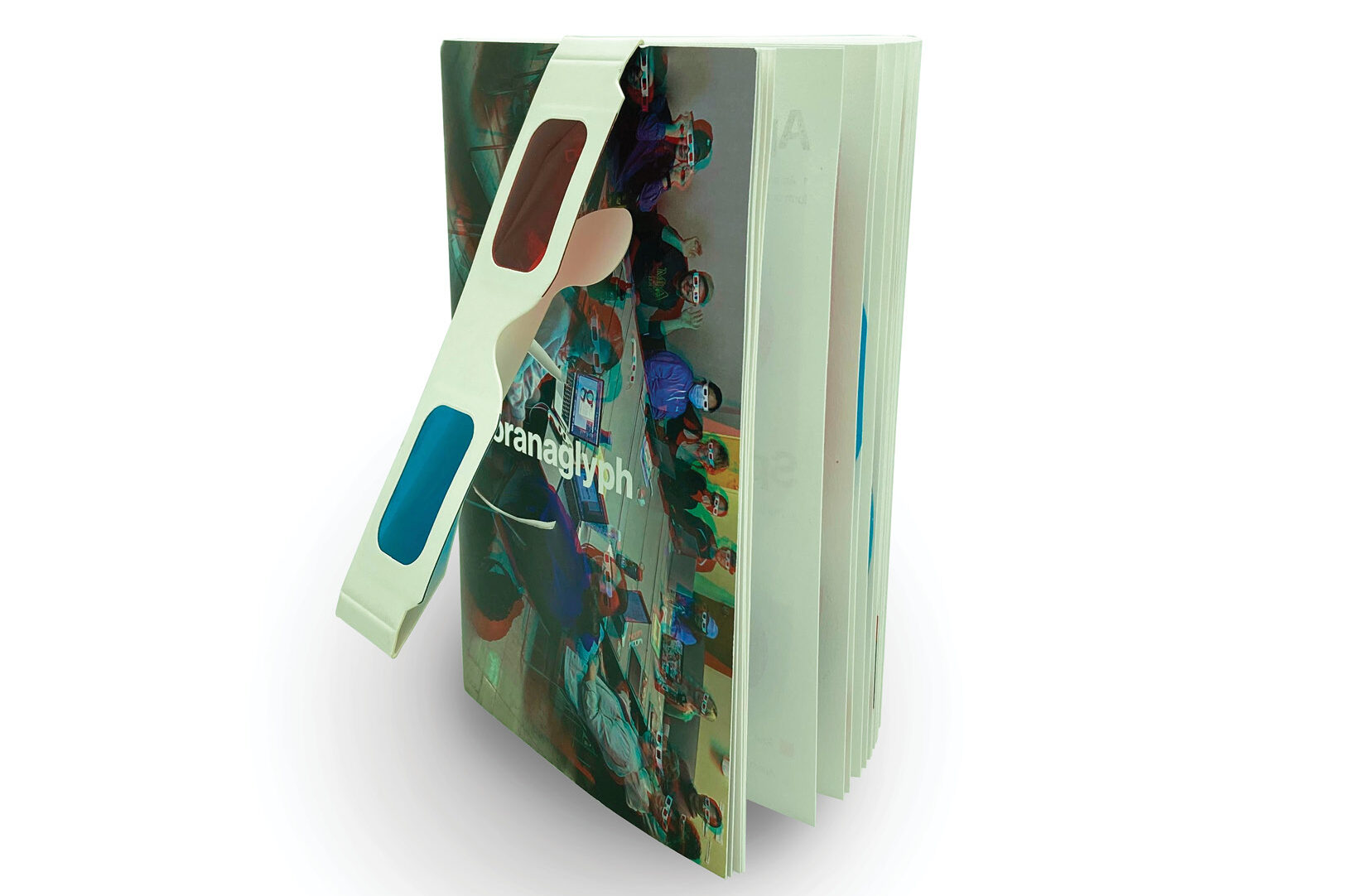
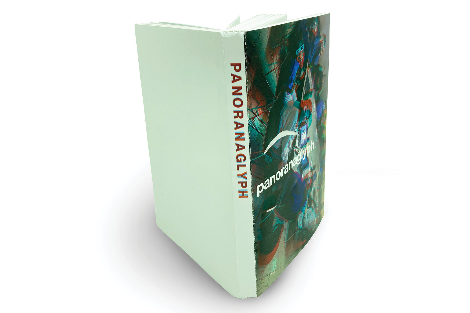
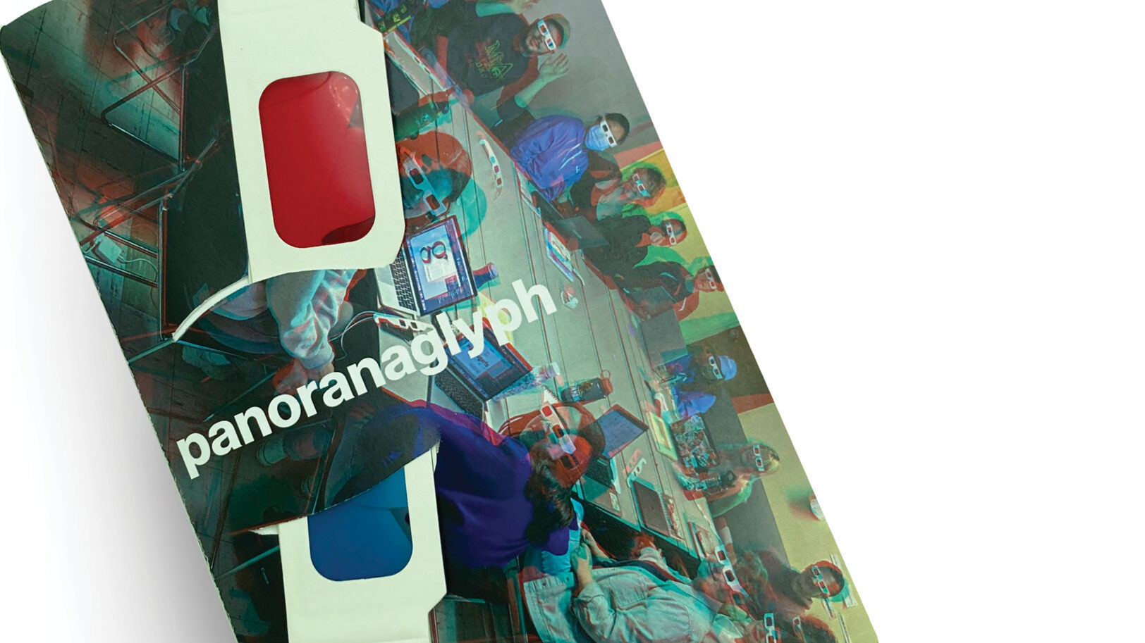
panoranaglyph
A dive into the categorization of unique typefaces and how to creatively compare them.
What
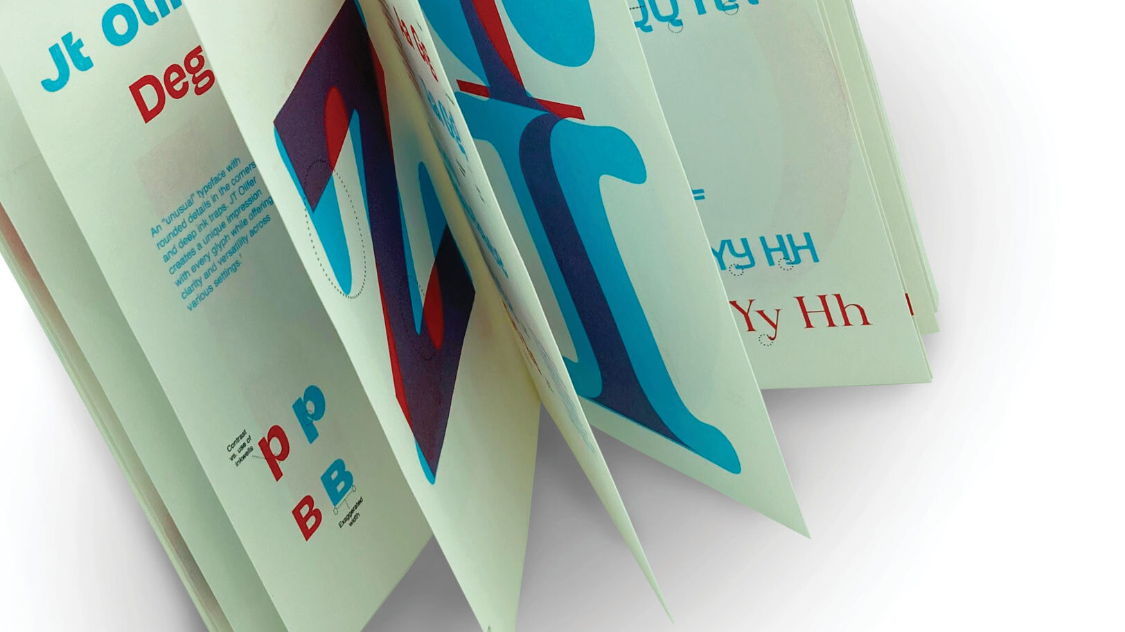
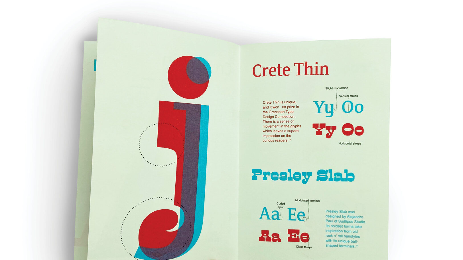
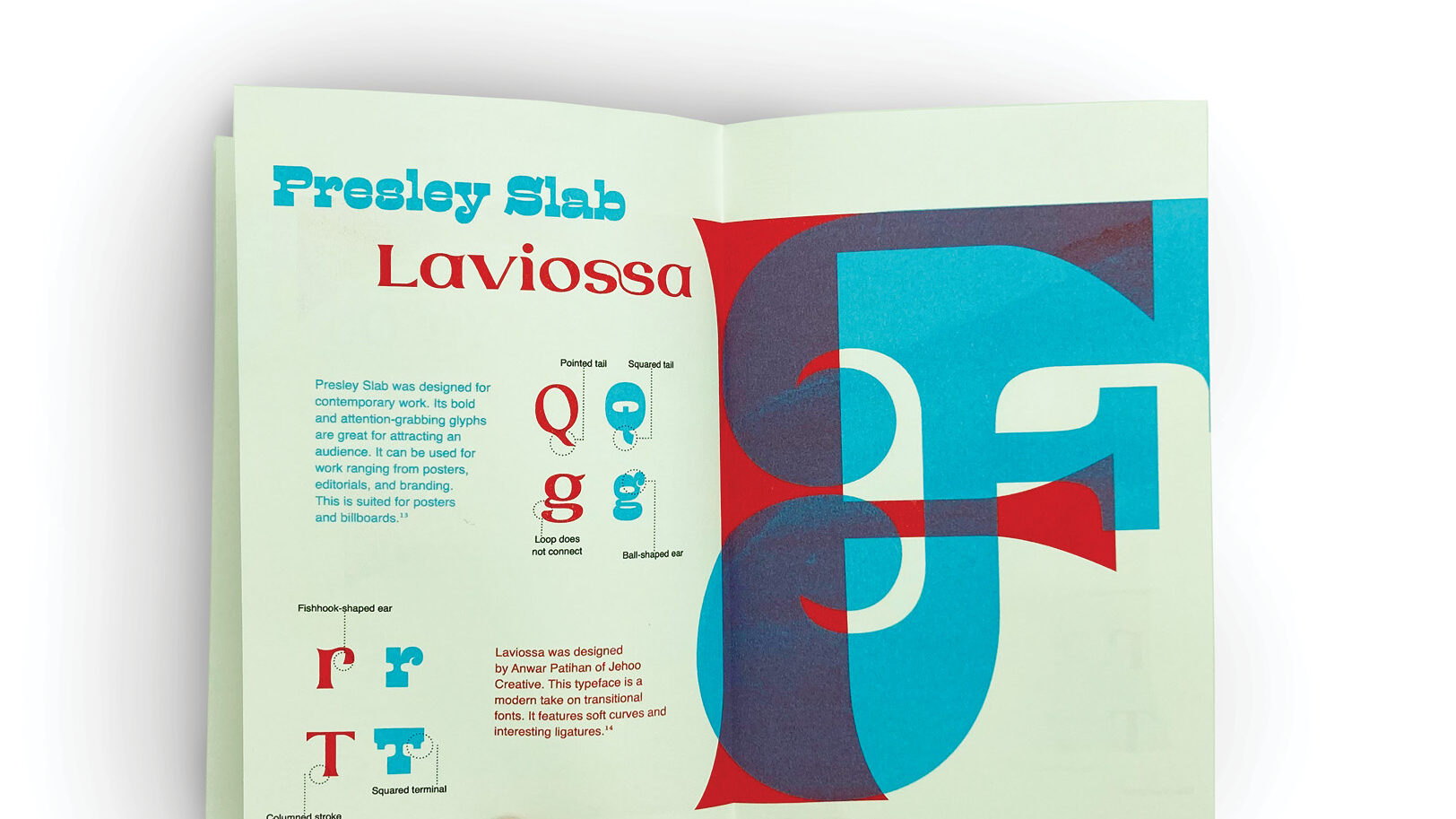
“panoranaglyph” utilizes the medium of anaglyphs to compare unique typefaces in a printed book format. A combination of RISO and traditional printing was used to create this publication.
Why
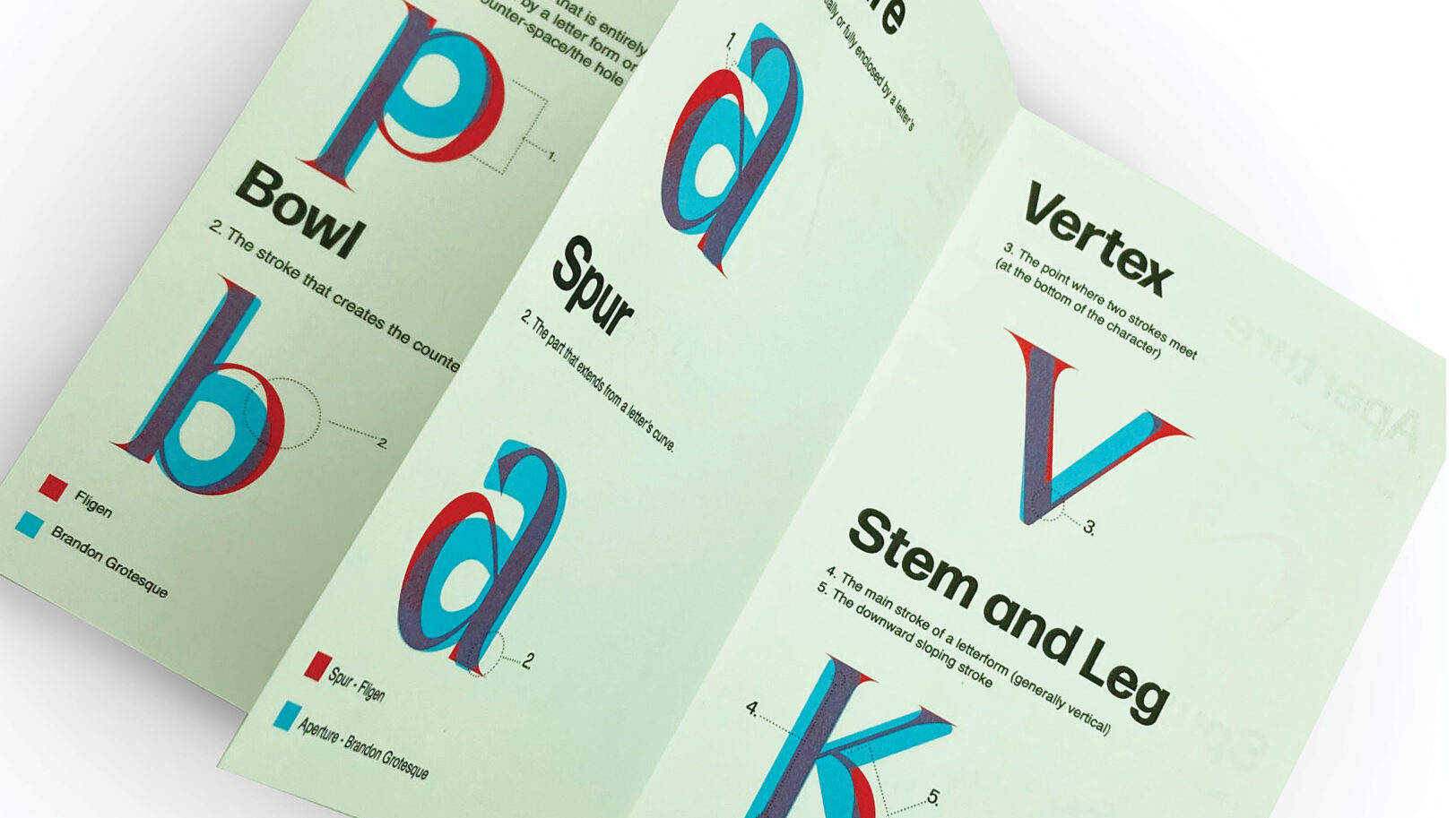
At Appstate, graphic design majors receive an in-depth education in typography and how to recognize detailed features. Our class was tasked with developing a new typographic classification system.
How
To complete this project, my class created a template and everyone contributed their unique typeface pairs. At the end of the semester, we printed, trimmed, and glued forty copies of “panoranoglyph” for both personal use and contribution to the department’s printed matter archive.