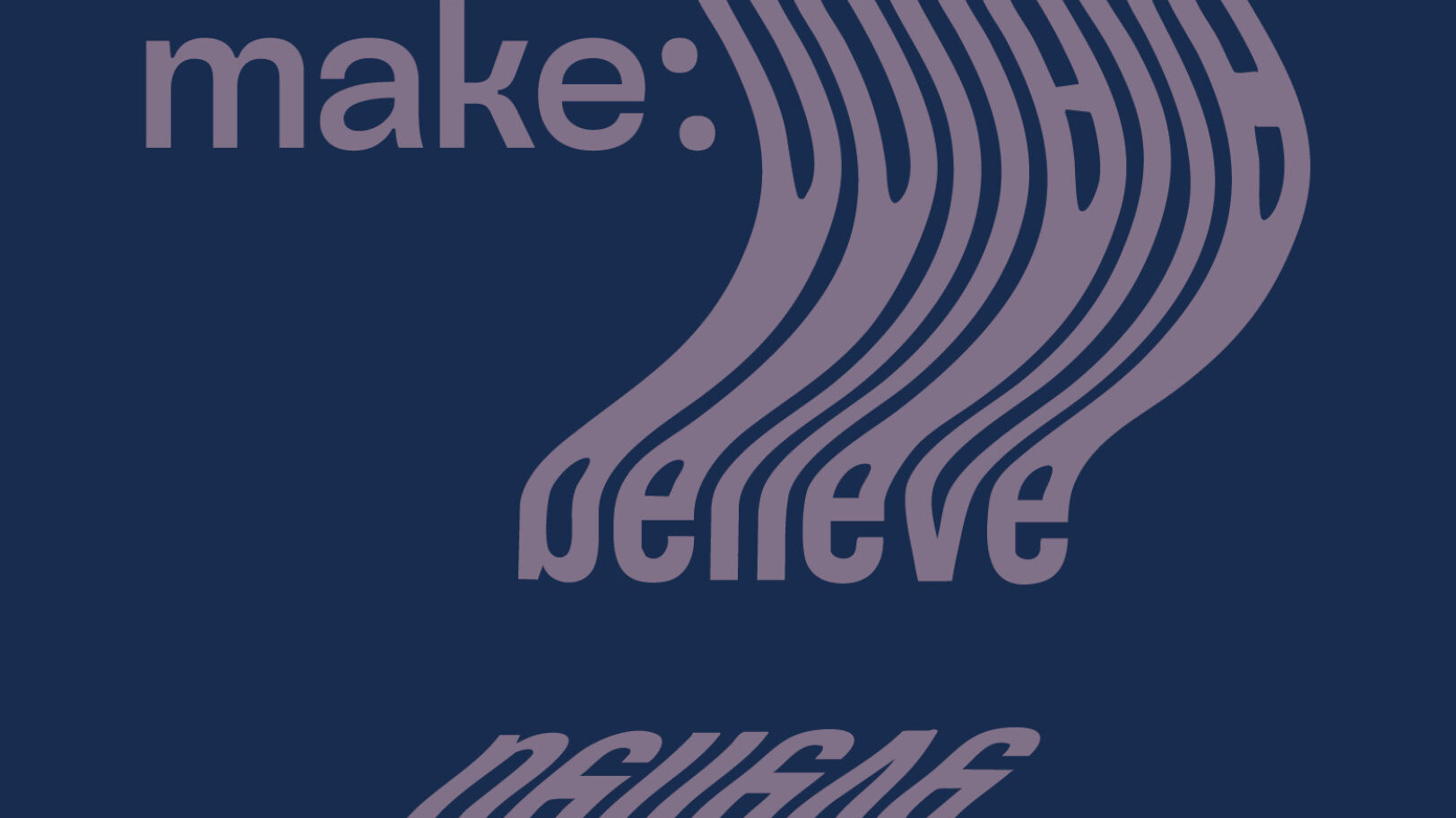
make : believe
A collaborative poster show showcasing ten graphic designers’ passions united under the umbrella theme of “make : believe.”
What
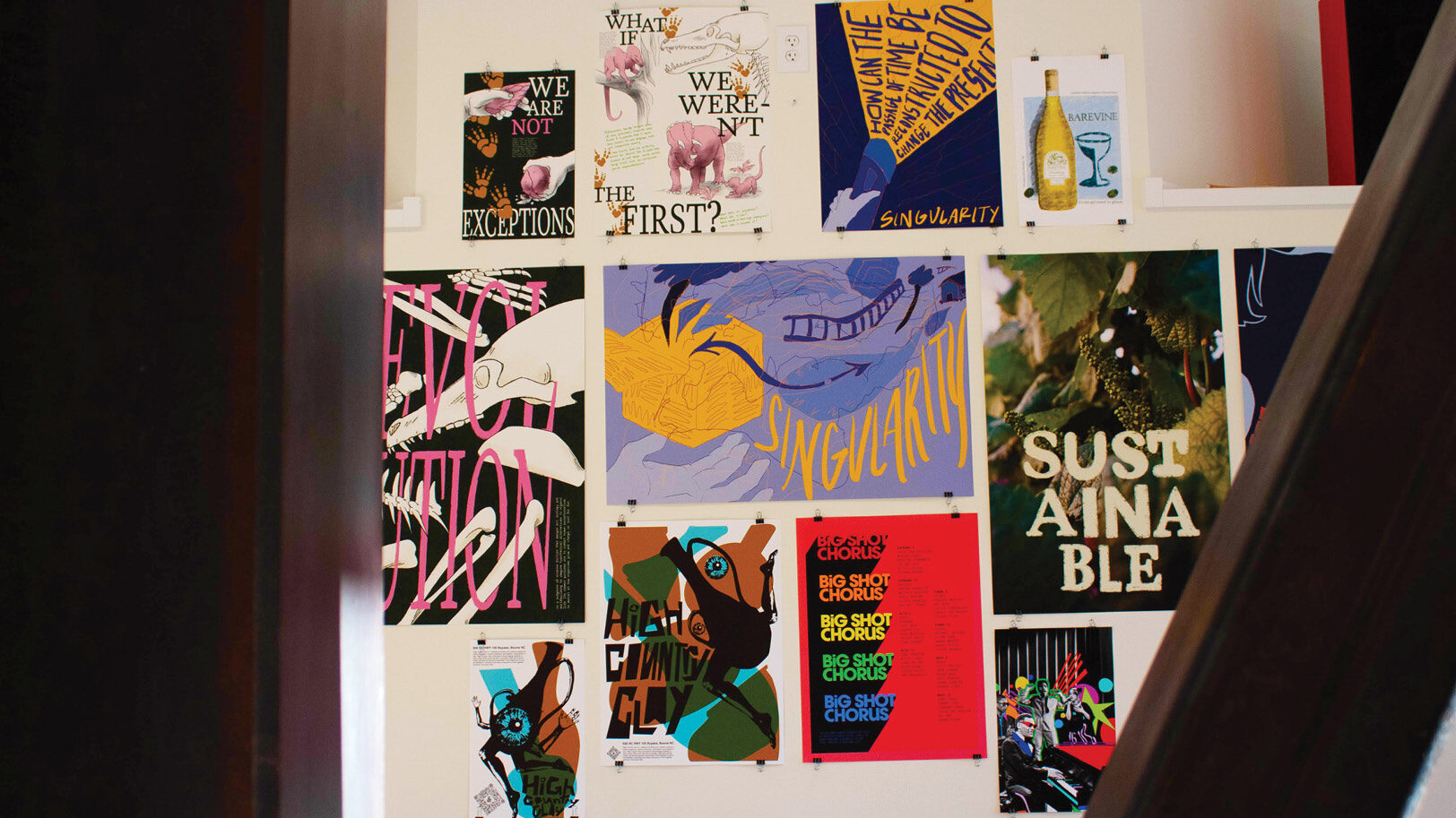
As a poster exhibition, “make : believe” encapsulated the creative “what ifs” of my senior class. During our final semester of Appalachian State University, we worked both individually and as a team to plan, brand, and produce the materials to bring “make : believe” into reality.
Why
What if we could use design to explore relevant topics and construct unique, creative solutions? With the power of imagination, anything is possible. This sentiment united the varying interests of my senior class to focus our projects under a common thematic message.
How
The planning, branding, and execution of our poster exhibition took the course of a semester to complete, facing hiccups and bumps in the road but ultimately resulting in an end product we were all proud of.
Upon reflection, the planning process took the most time as our class of designers struggled to settle on one idea for the exhibition that we could all agree on. Ideas such as a traditional art exhibition, art market, and public printing experiment flew around. However, we were not sure how any of those ideas would encompass all of our individual design theses.
After much discussion, research into other graphic design inspirations, and mood-boarding, we came up with the idea of a poster exhibition centered around the idea of “what-ifs”. The medium of posters would visually harmonize our various theses, and keeping the overarching theme open to interpretation would give us enough flexibility to push our ideas in a unique manner.
Following the theme of “what-ifs,” we brainstormed the title of “make : believe” which added a sense of whimsy and imagination to the exhibition. What if the posters we designed not only presented the problems we were interested in but also provided some sort of solution or takeaway for audience members to chew on?
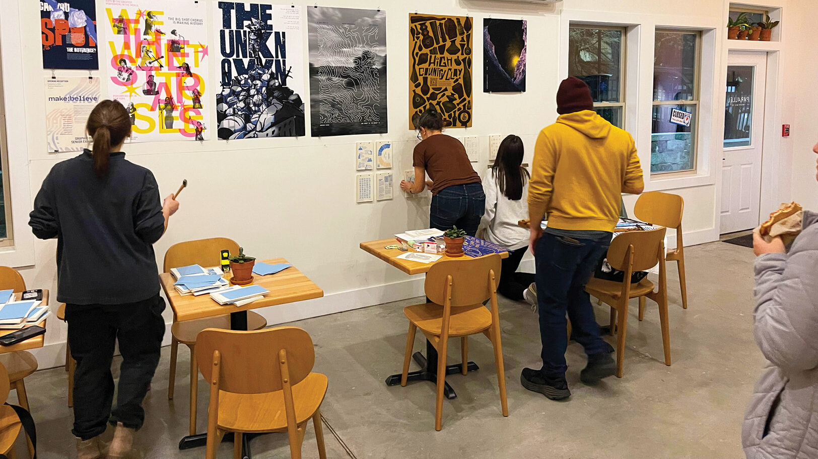
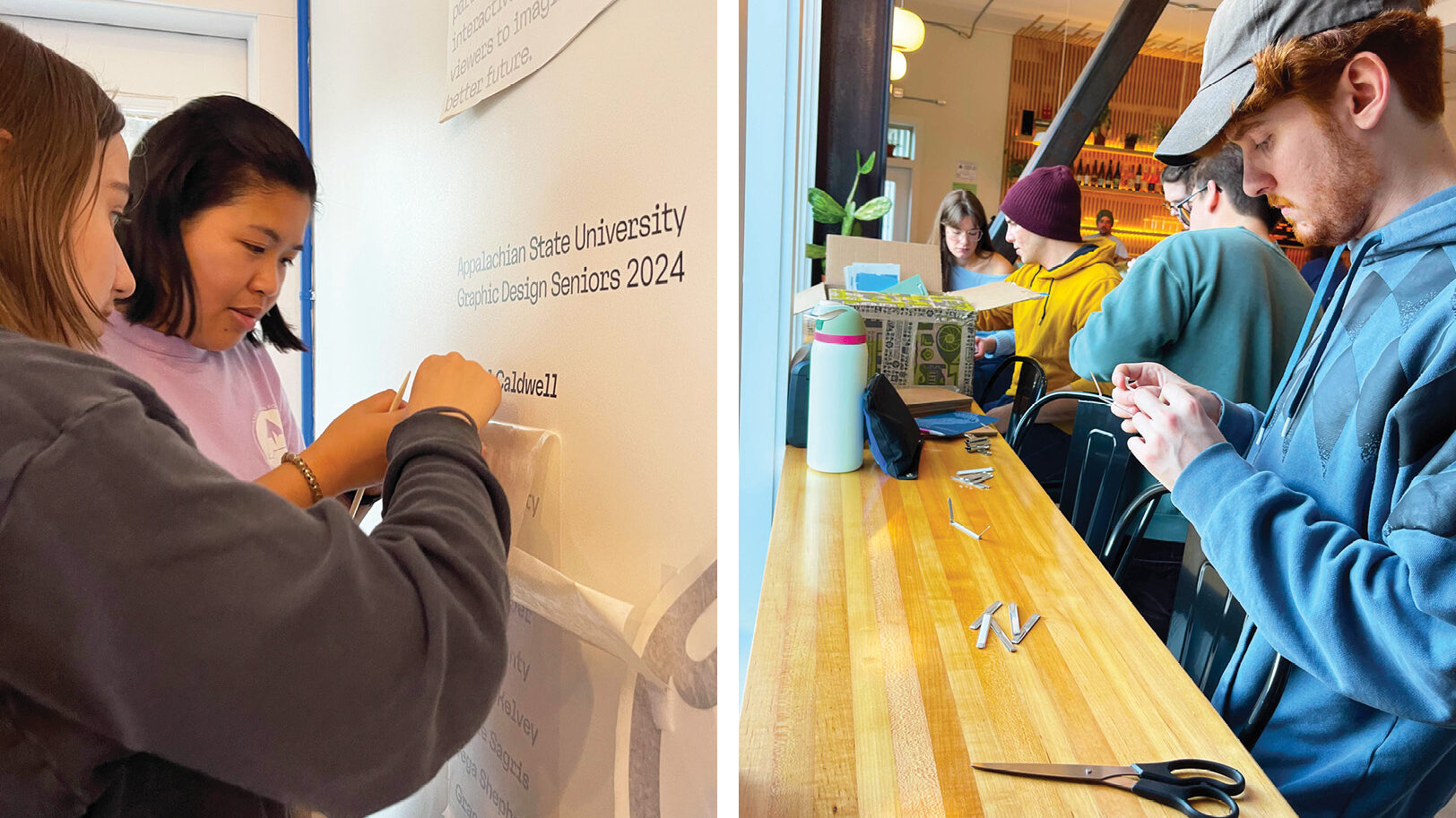
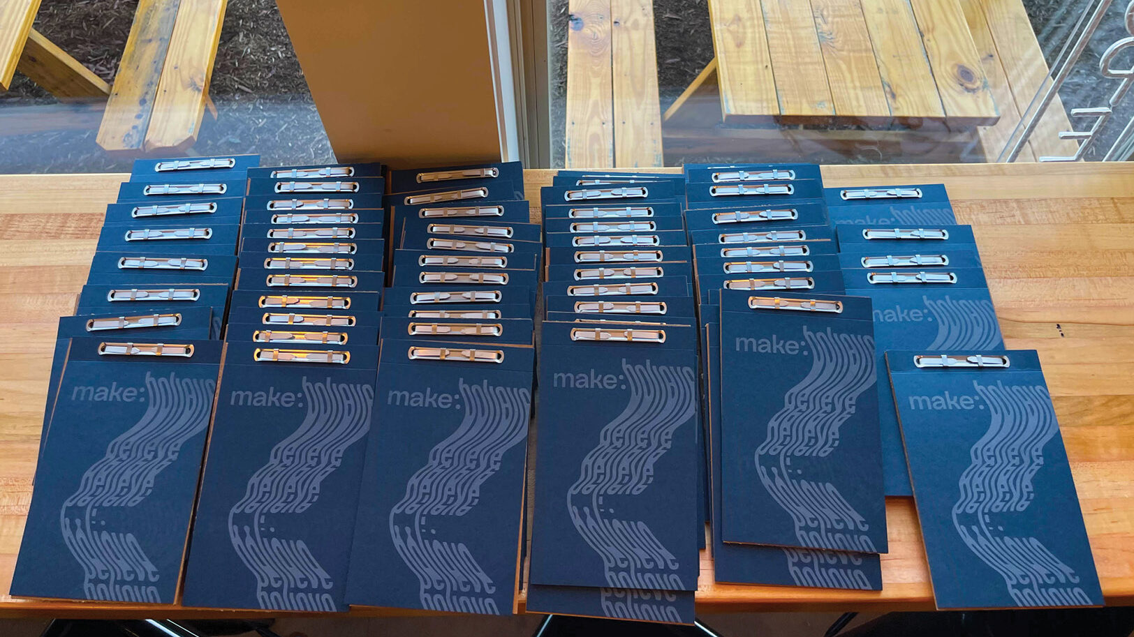
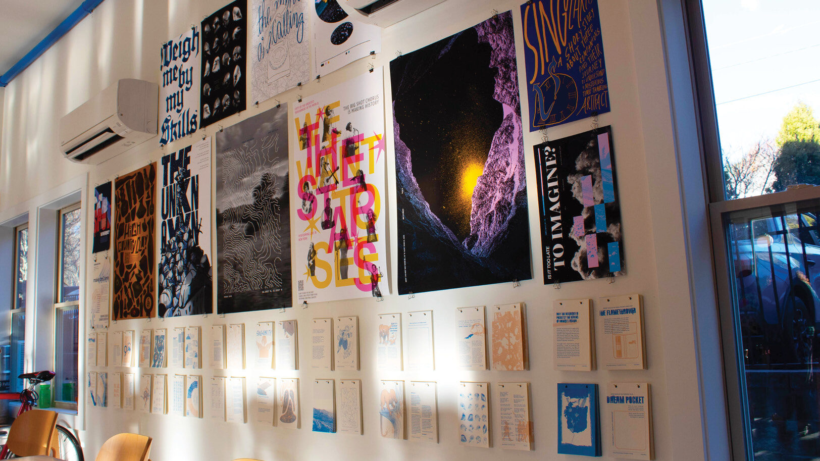
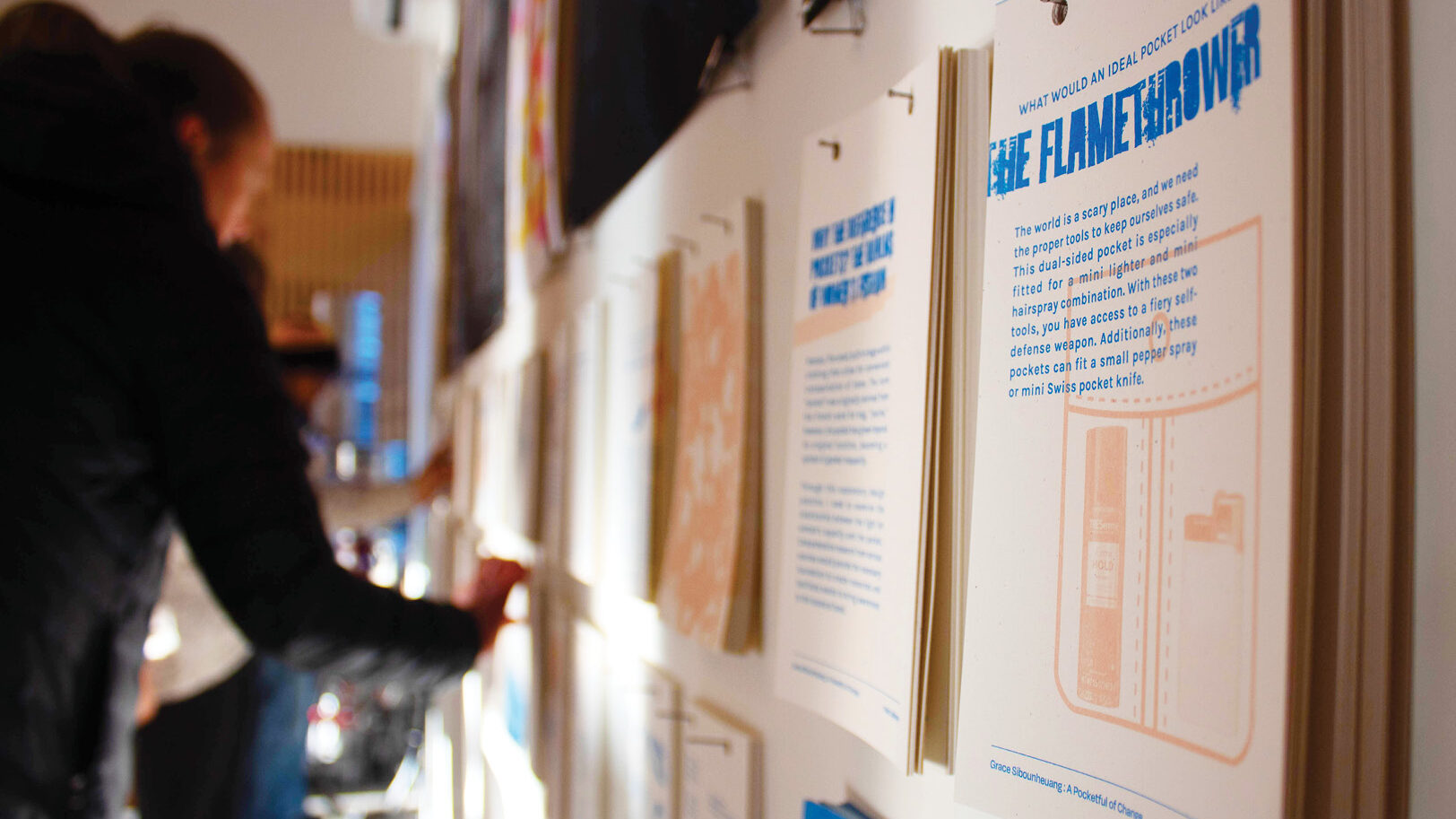
This train of thought led to the inclusion of a takeaway item. In this case, it became a build-your-own booklet that allowed audience members to directly take project pages that resonated with them and combine them into their own booklet using the materials provided. This aspect was especially important as it enabled the audience to keep thinking about our ideas even after the exhibition was over.
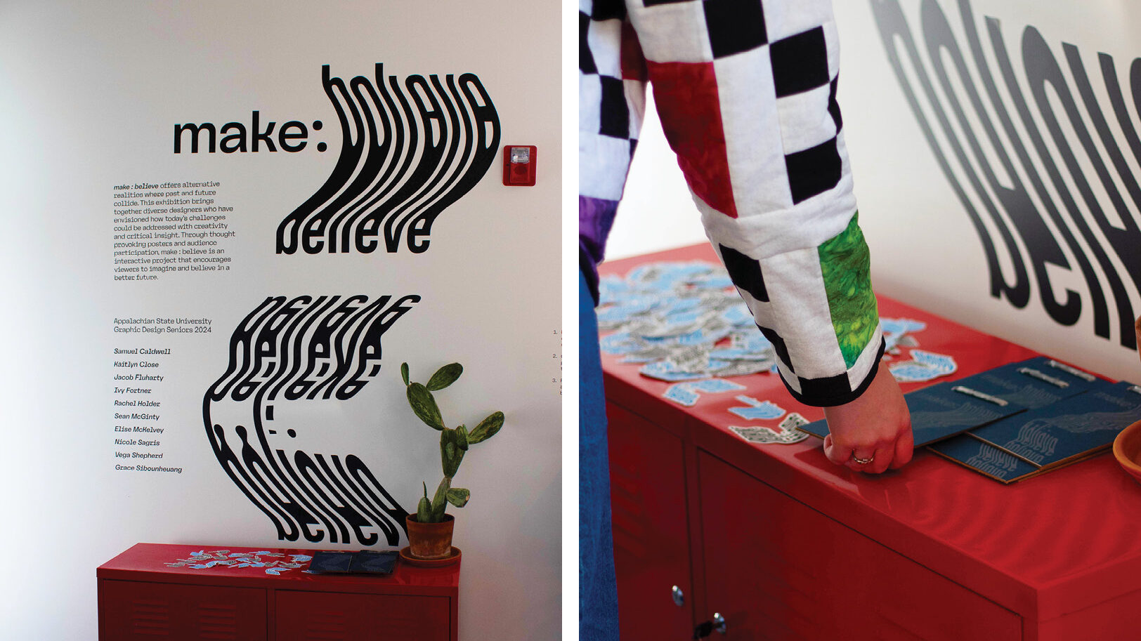
In terms of branding, we decided to keep it simple in order to let the posters and takeaway booklet shine during the exhibition. Our professor suggested scanning printed text to achieve a logo mark that expressed motion and curiosity, and we experimented with different typography and scanning methods until a useable logo mark was created.
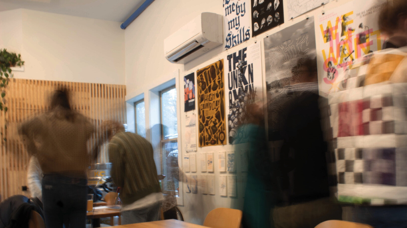
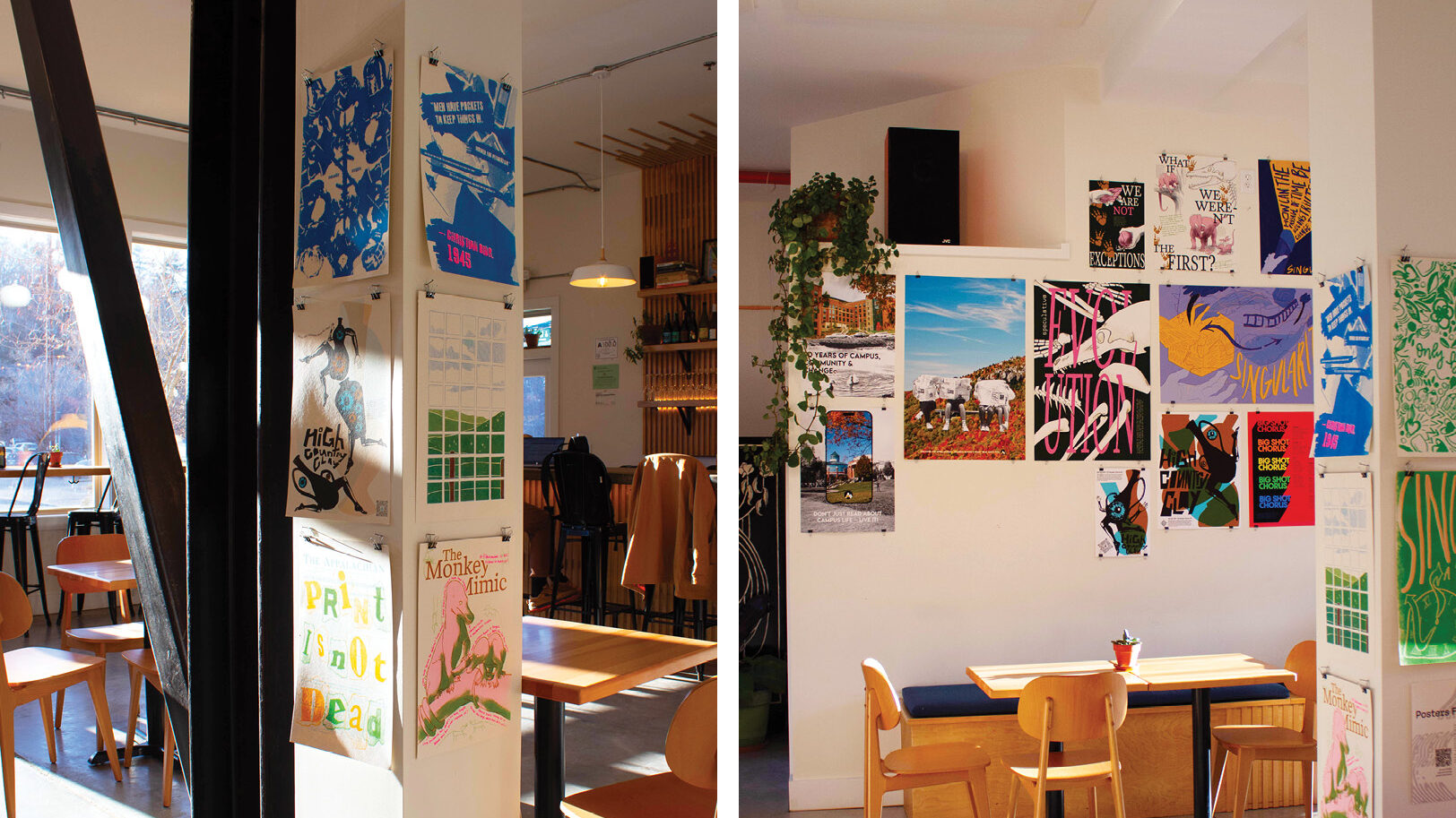
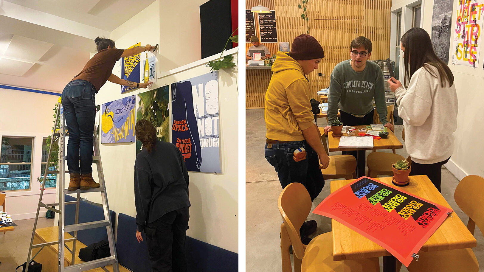
Over the course of three days, our class and advisory professor came together to set up the poster exhibition at Parallel Brewing Company. I am proud to have helped install the vinyl wall decoration that introduced the exhibition to the audience as I had the opportunity to learn how to use a vinyl printer and how to design for real-life environments.
Ultimately, we held a successful reception for our poster exhibition, and the audience was very excited about being able to interact directly with our work through the takeaway booklet.