Champa
Experimentation with rebranding and learning the basics of restaurant design.
What
This is a fictitious rebranding of a local restaurant, Champa Thai & Sushi.
Why
For my branding design elective, I was tasked with rebranding a restaurant.
How
Growing up, I felt that Champa was an excellent opportunity for those unfamiliar with Thai/Thai-adjacent cuisine to try it out, but I also felt a disconnect between their current branding and what they sought to achieve. As a fictitious rebranding, I took this opportunity to develop a cohesive and bright brand that reflected the kind of service and food that Champa provides while attracting more millennial and Gen-Z customers.

To get started, I researched local competitor restaurants and took note of their services and branding elements. This was followed by the development of three distinct rebranding directions that were represented by images found through various sources, such as Pinterest or Design Inspiration.
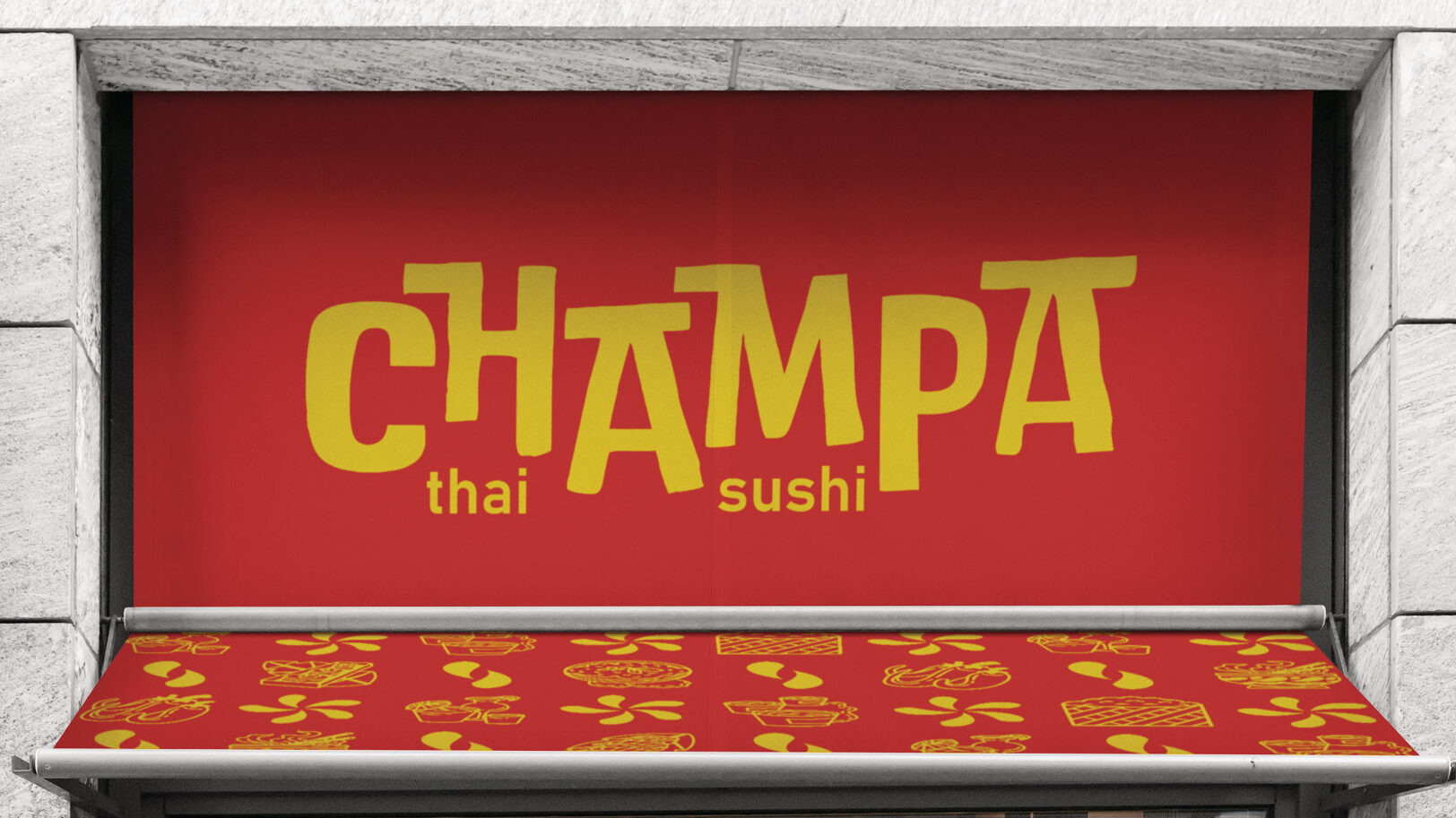
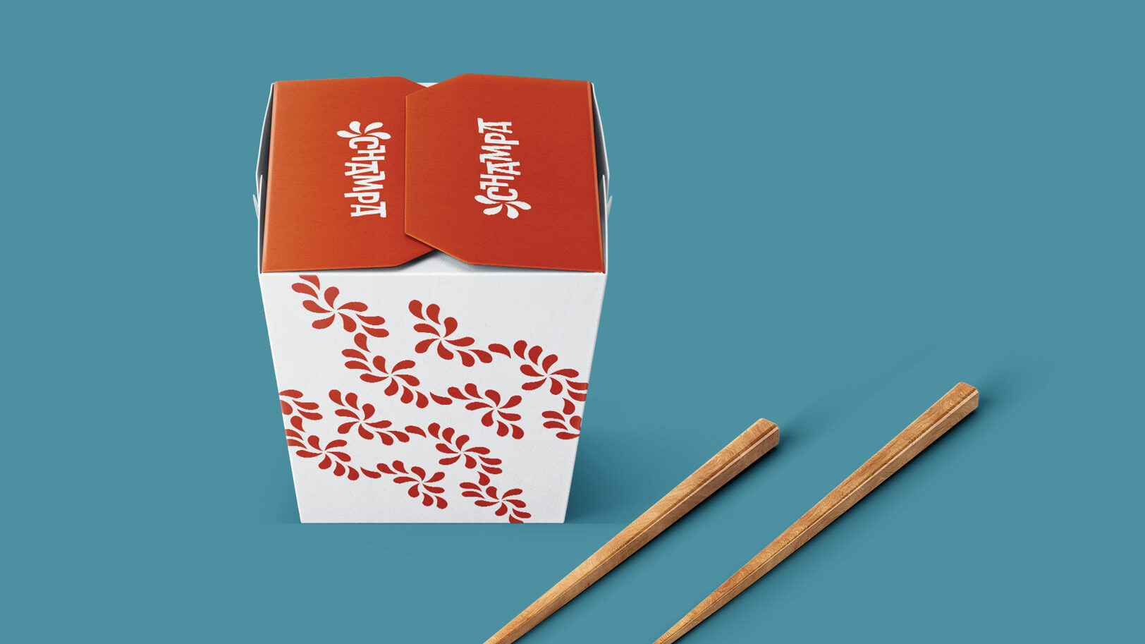
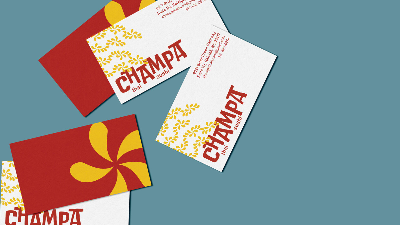
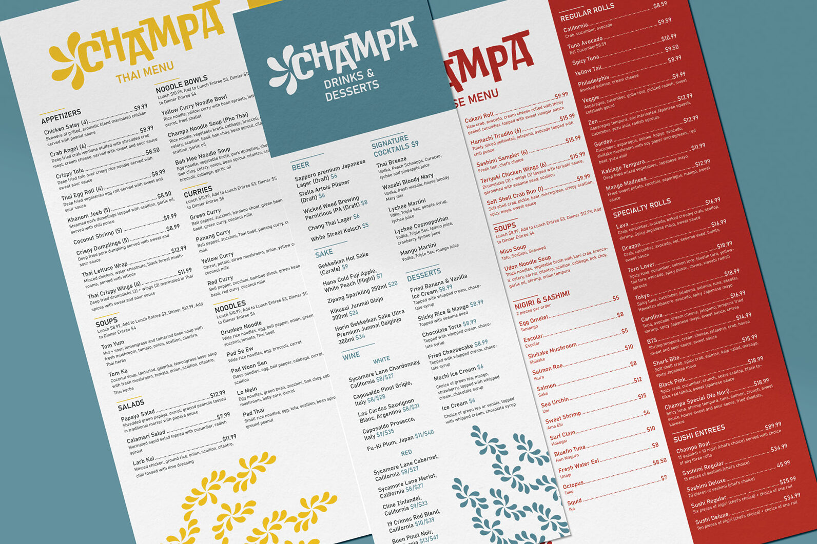
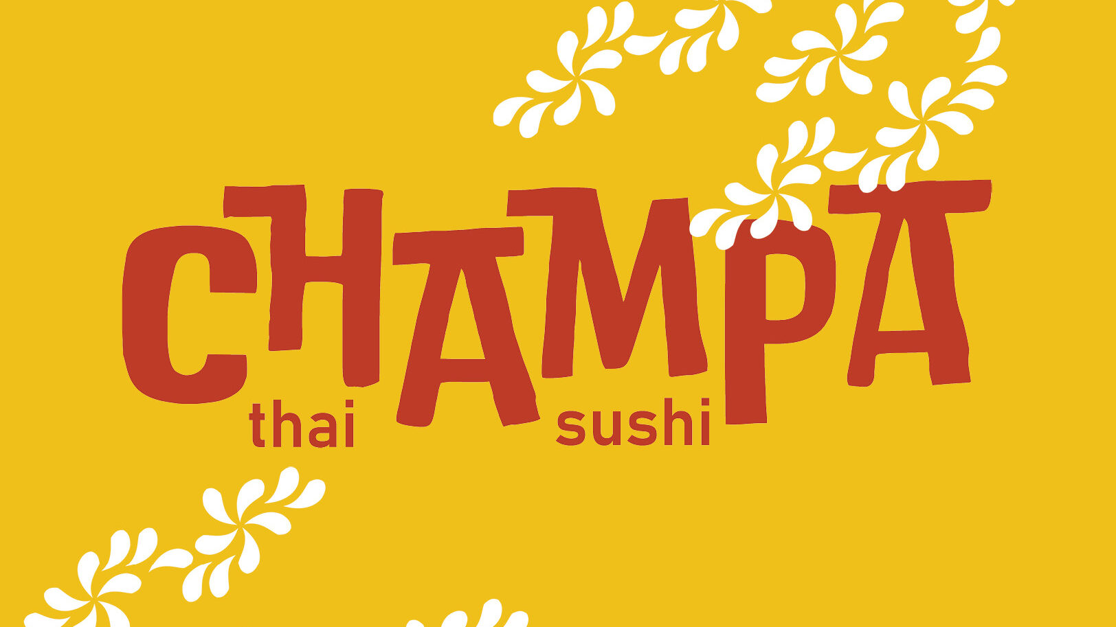
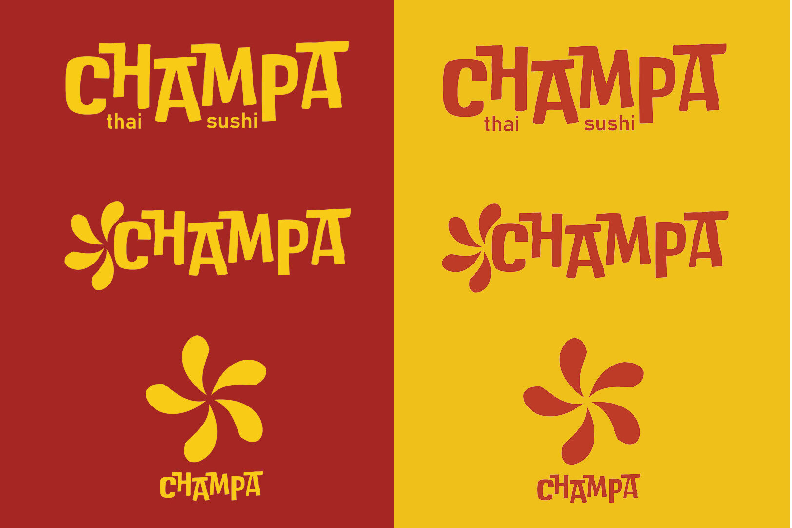
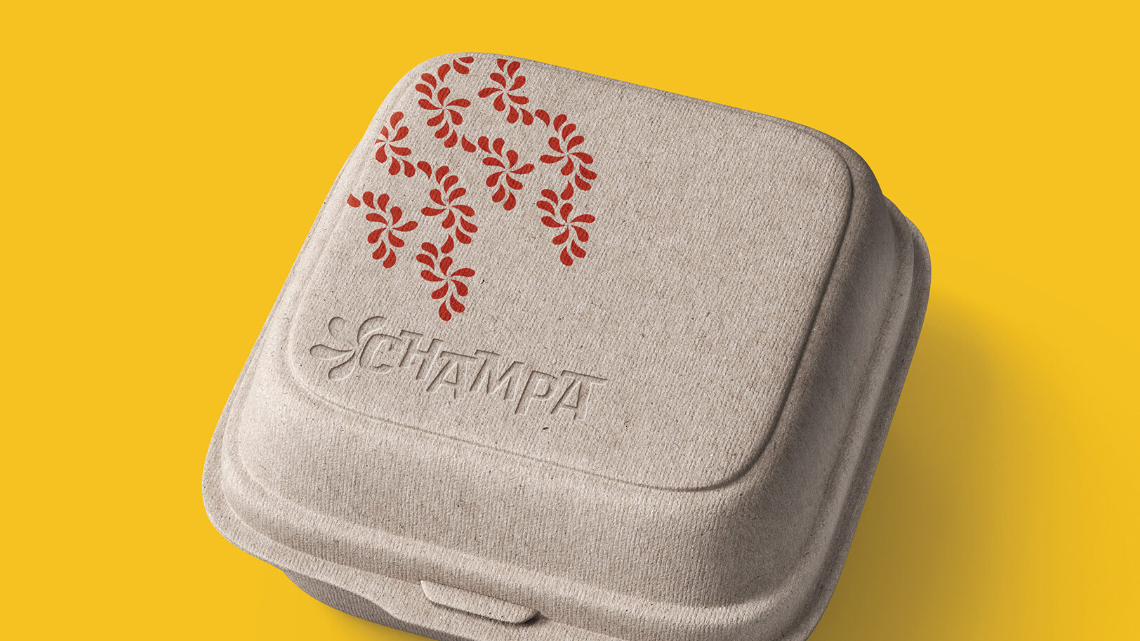
After feedback from my peers, I moved forward with the direction inspired by the beaches and markets of Thailand. Thus, Champa’s rebrand focused on bold typography and color to stand out against similar restaurants in the area. Additionally, a mixture of repeated and free-flowing patterns provided consistency with Champa’s location and take-away products which increases its memorability with their key customers.

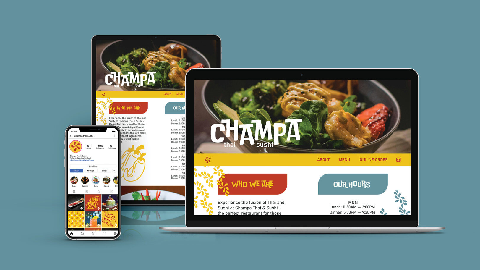
The final branding materials and mockups were compiled into a simple brand guidelines PDF and submitted. I presented Champa’s rebrand to the class and explained key branding decisions were made and how theses decisions would help attract and retain the target millennial and Gen-Z audience.