Local Roots
Exploration of design for social good and thinking about meeting local community needs.
What
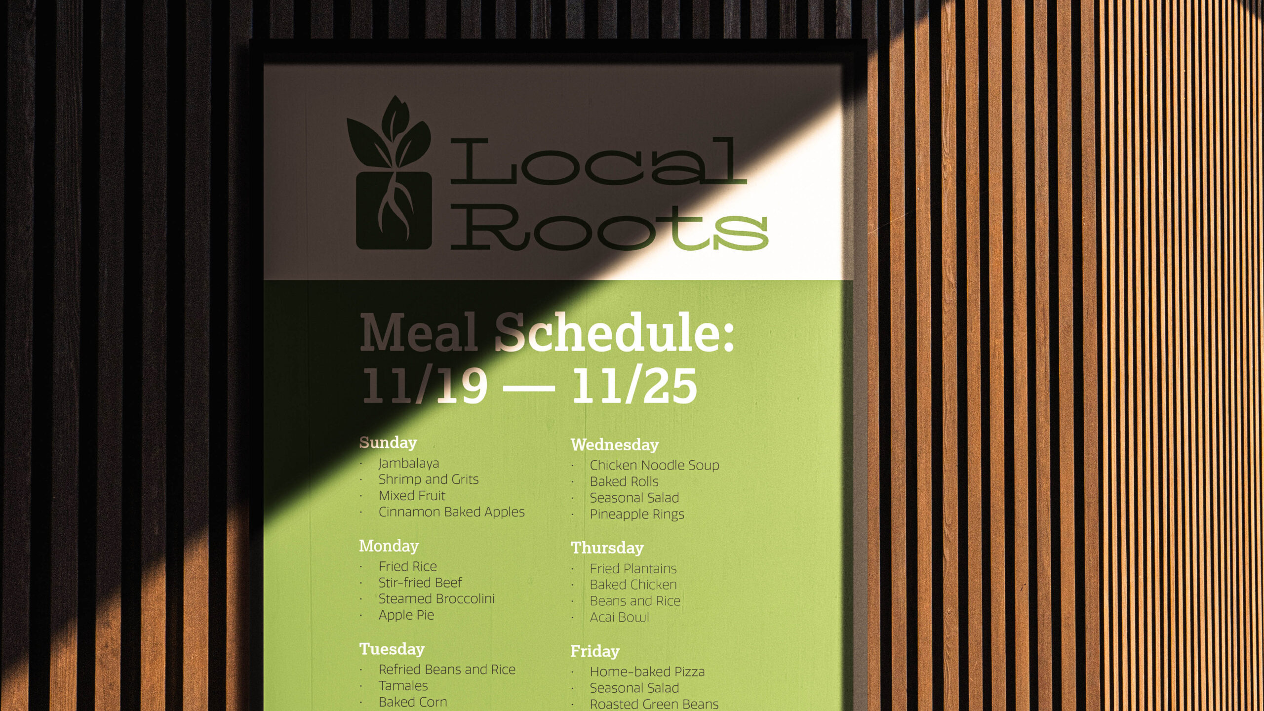
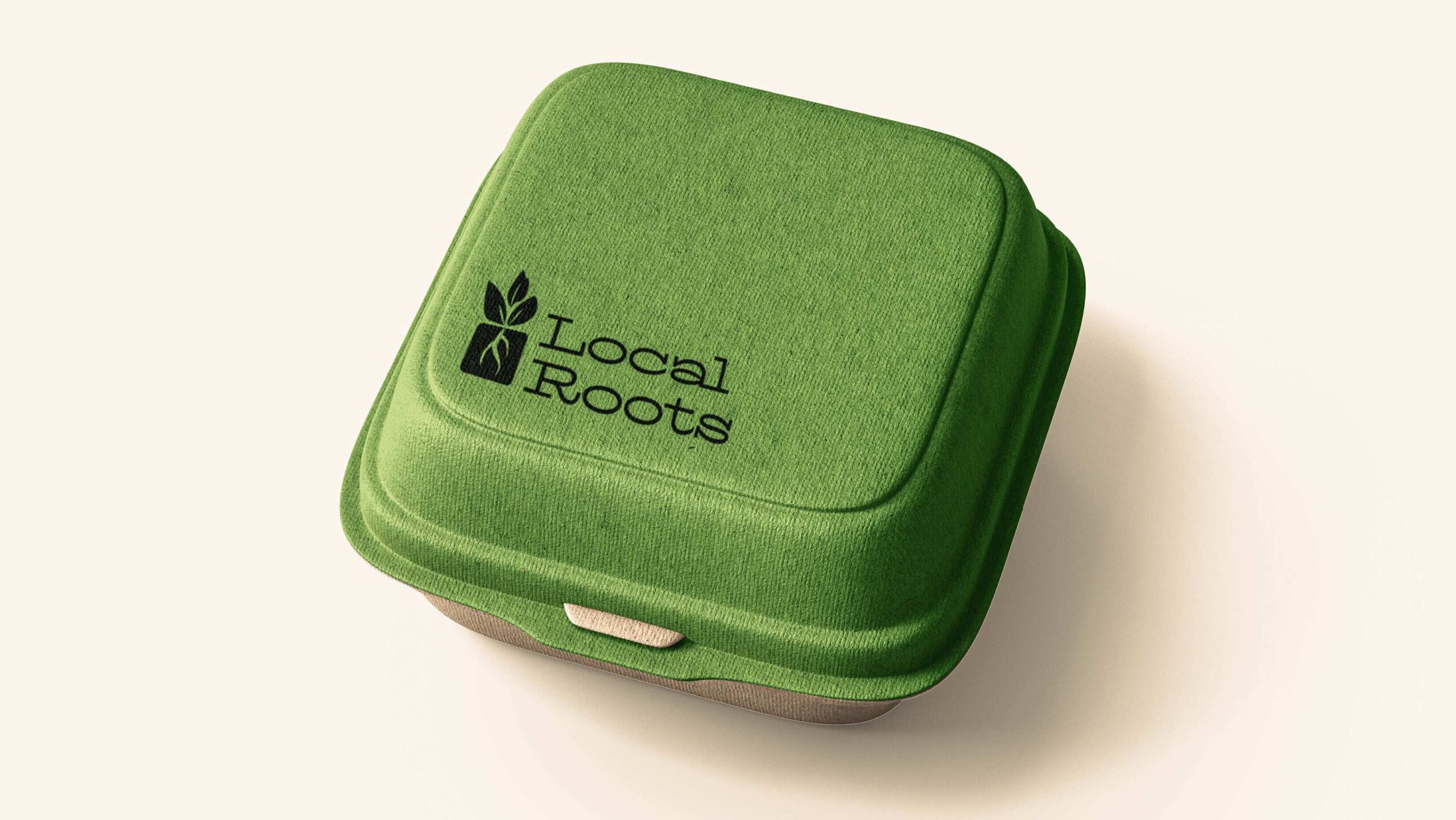
“Local Roots” is a fictitious community pantry organization based in Southeast Raleigh that focuses on bringing free food to the people.
Why
During a typography class, we were asked to create a community-based organization and think about how branding influences the perception of its services.
How
In a previous general education class, I learned about the concept of food deserts and how prevalent they were in the United States. Food deserts are places where access to nutritious food is difficult, and with some research, I discovered that Southeast Raleigh was considered one. Thus, I decided this would be the focus of my community-based organization.
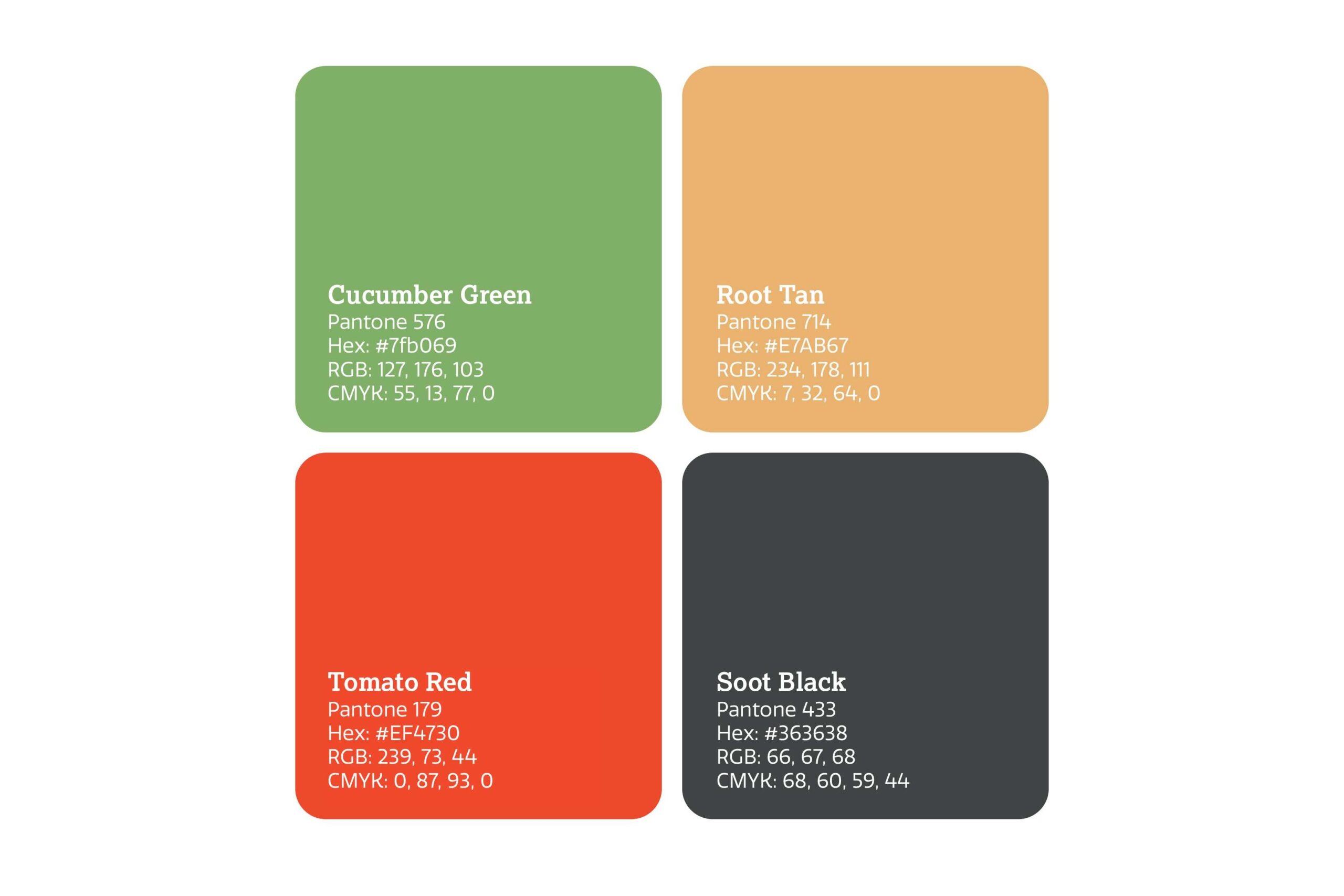
When thinking about logos and color palettes, I drew inspiration from farmers markets and gardening to create a mood that was inviting and encourages participation from the community. To emphasize the freshness of the products and commitment to nutrition, I created complementary illustrations of vegetables and fruit that could be used as patterning.

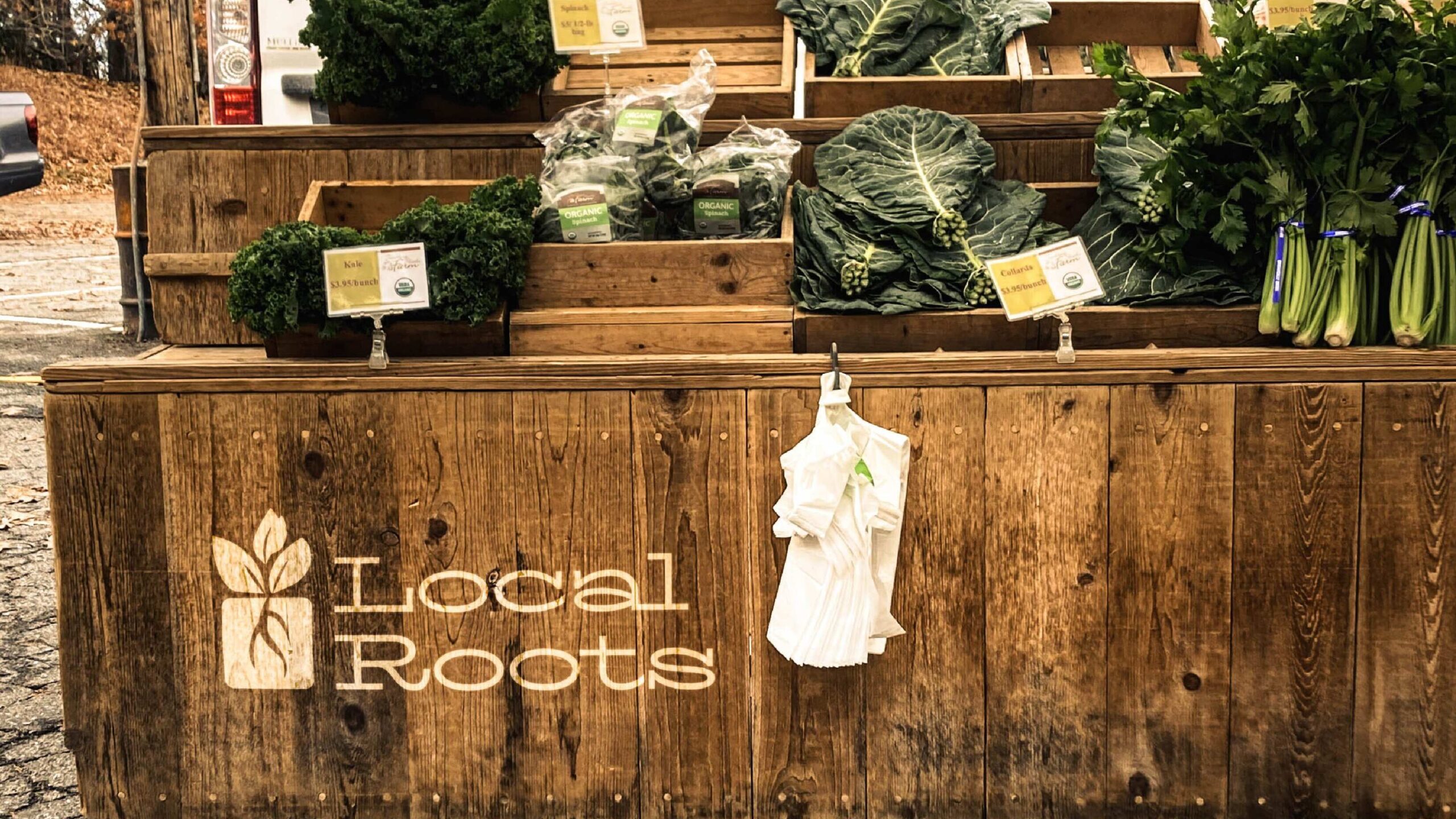
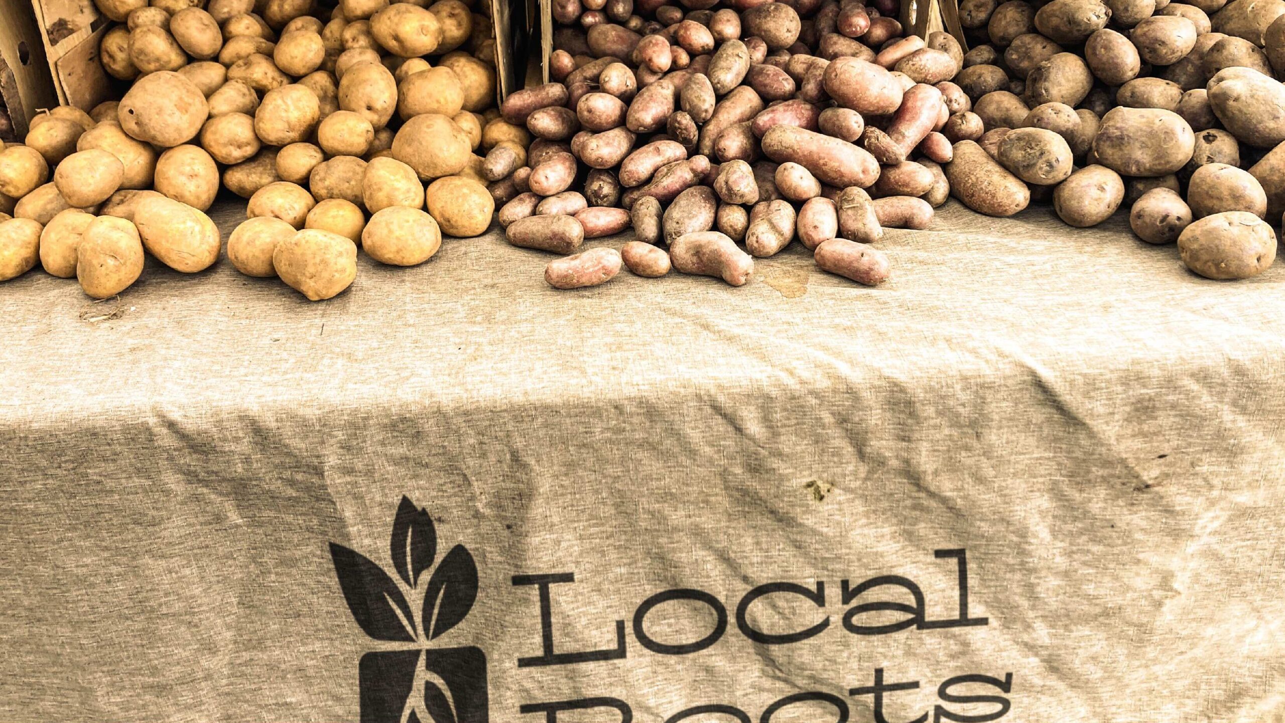
In the final presentation, I made sure to include warm toned photography and mockups to help the audience envision what the actual community fridges look like. The photos used were a combination of stock photos and images I personally took while visiting a local farmer’s market.